

On webinars, visuals matter as much as words. Those of us who aren’t graphic designers need easy ways to communicate visually.
Fortunately, Canva is changing the game — again.
When Canva debuted, it replaced Photoshop (no offense, Photoshop) as the go-to tool for creating images, with almost no learning curve. Now, Canva is boxing out tools like Powerpoint and Keynote (no offense, Powerpoint and Keynote) for no-hassle slide decks.
We’re all about that kind of user-friendliness.
To wit, this guide is a “how to” for creating stunning slideshows using Canva’s super-intuitive tools.
Let’s get started!
How to Create Webinar Templates in Canva
If you are looking for ways on how to create webinar templates in Canva, here is a step-by-step guide for you:
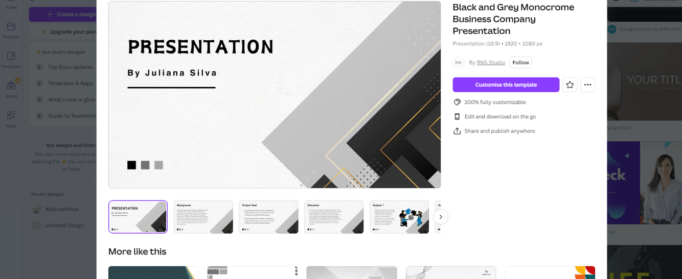
Step 1: Choose Your Template
Canva has done an outstanding job of streamlining the creation process with presentation templates to match any industry, style, or webinar objective.
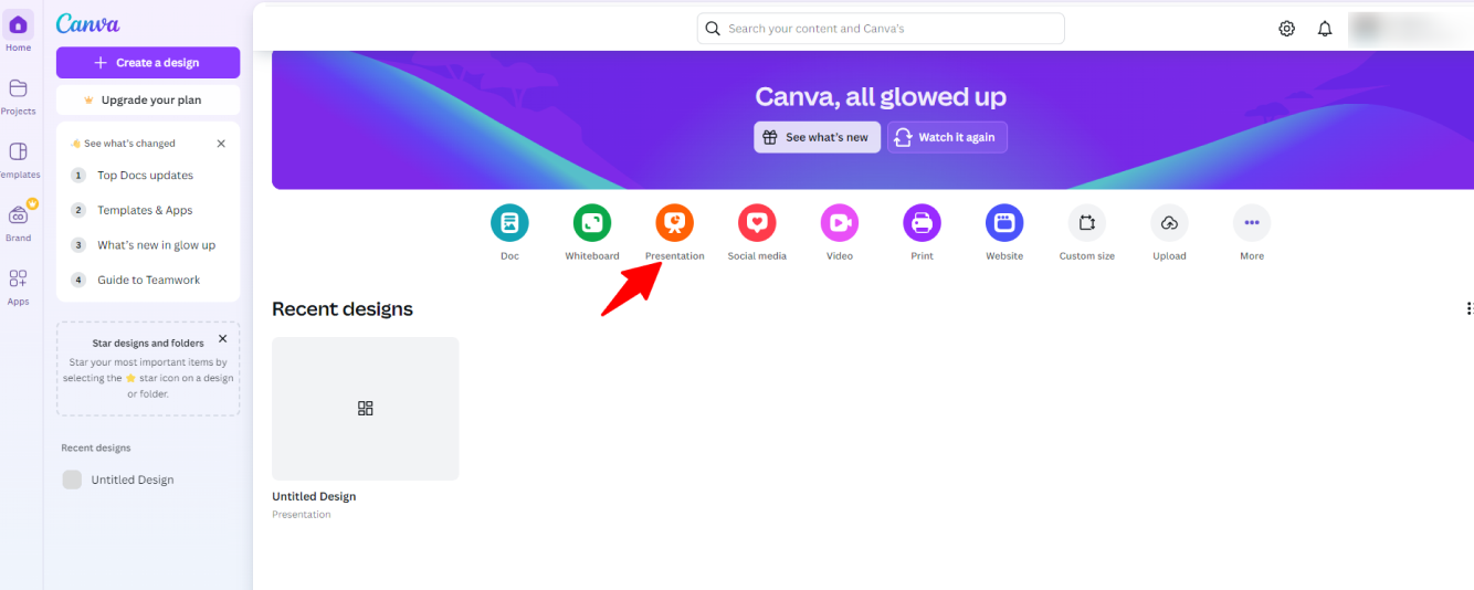
From your Canva homepage, click “Create Design” and choose “Presentation” from the dropdown menu (if you don’t see it, just enter “Presentation” into the search bar).
Presentation templates on Canva are at the perfect aspect ratio for webinars, as viewed on computer screens or smart TV’s: 16:9.
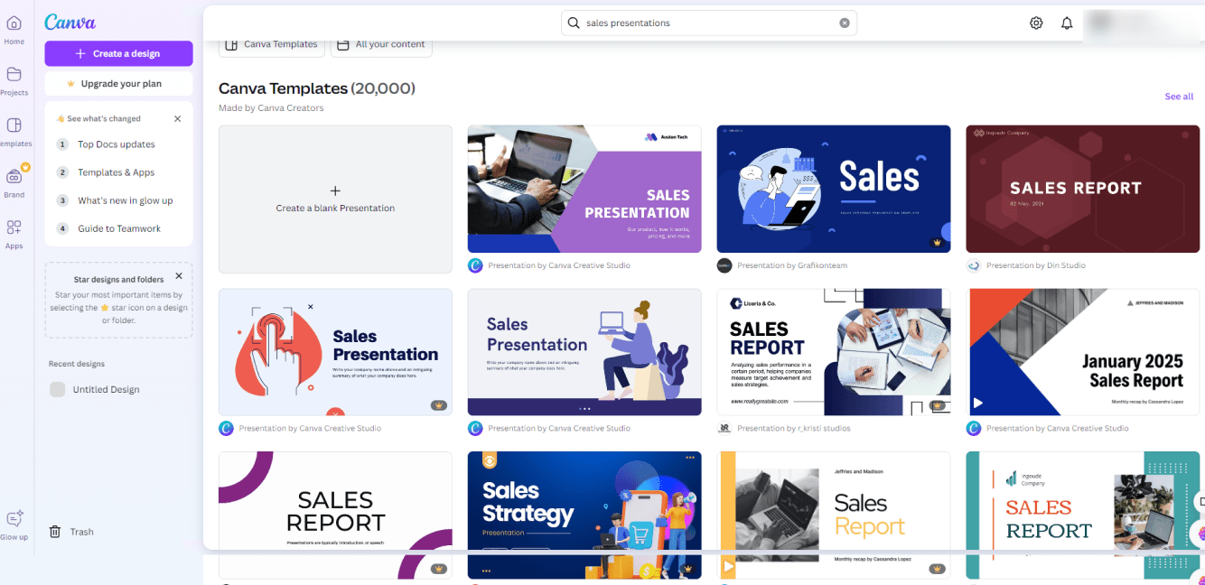
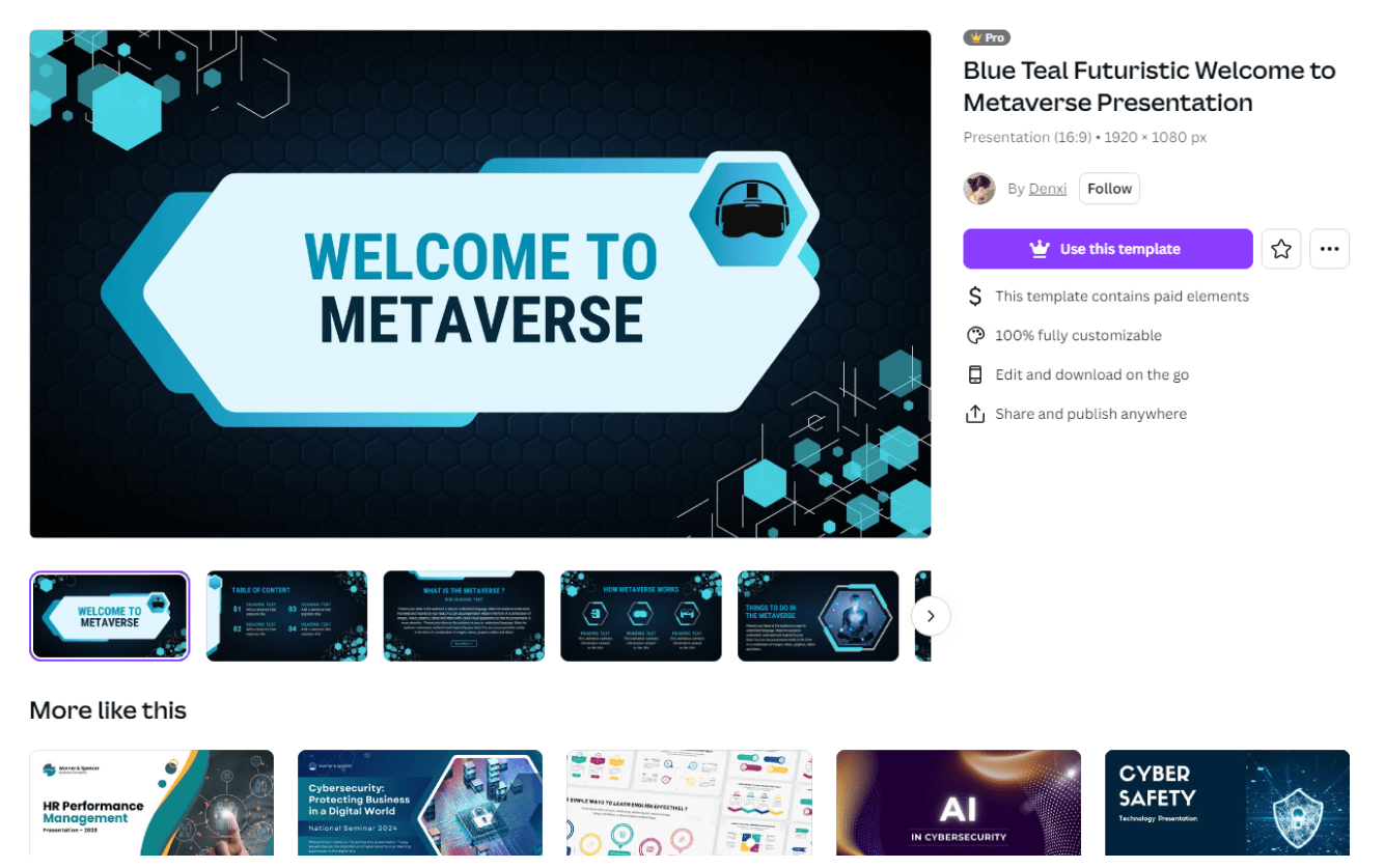
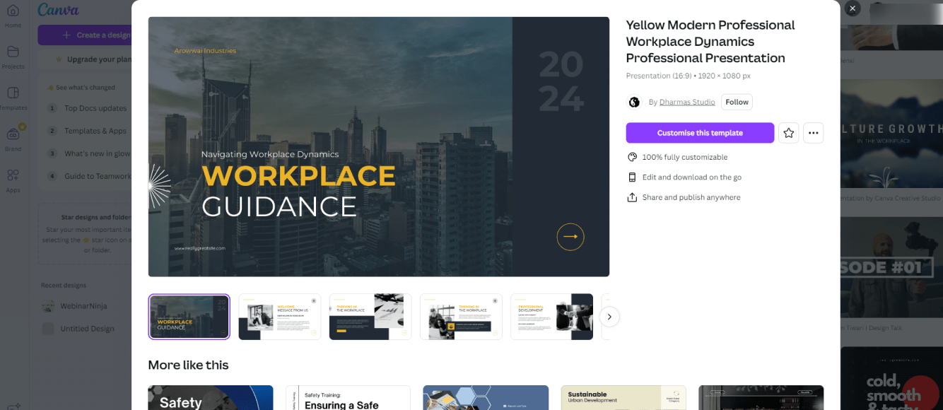
From there, you’ll get a huge array of dozens of slide presentation templates. Seriously, there’s a ton. At first, you might be worried that there are too many to choose from!
But fortunately, Canva organizes these templates into categories, so you can quickly narrow down the vibe you’re looking for. We love the options under “Education” and “Marketing” (especially since we believe teaching is the new marketing).
Depending on the time you have and your experience using Canva (don’t worry; you don’t need much before you get the hang of it), you can choose more elaborate templates or simpler ones — and everything in between.
For us, we like our webinar presentations like we like our software: clean and simple. Under “Marketing,” there are some beautiful options that are minimalist but refined. In other words, they’re professional but not too “busy” or distracting.
Here are a few that fit the bill for us:
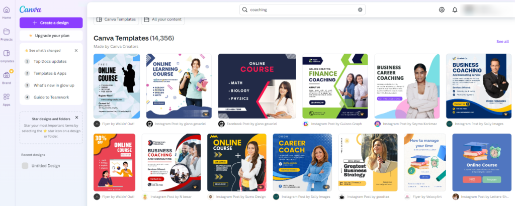
Bonus: for our coaches out there, you can simply enter “coaching” into the search bar above the templates for an array of coach-specific templates.
Our best advice for choosing templates comes down to this: have some guidelines, but be intuitive. Scroll through the options under the category that best fits your needs, and see what pops out at you!
Odds are, the templates that pop for you will pop for your ideal customer. And remember, you can always modify a given template to match your brand aesthetic.
Speaking of which…
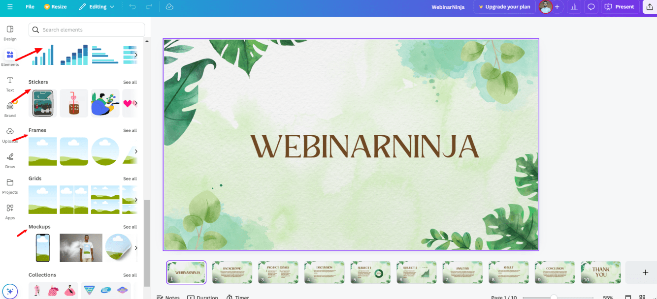
Step 2: Brand & Customize
This is the best part about the tool.
When you choose a Canva template, you’re not restricting yourself to someone else’s vision. More importantly, you’re not restricting yourself to someone else’s brand. The interface makes it easy to customize pretty much every aspect of any template.
Basically, you can use Canva’s professional template design as a foundation, but play with the details until you create something unique.
A distinct, branded color scheme is the key to customizing the template. If you haven’t established your brand’s palette just yet, Canva has a fantastic guide to choosing a color scheme and ridiculously cool tools for nailing the exact hues and hex codes.
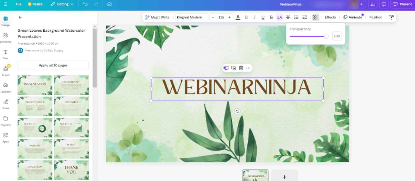
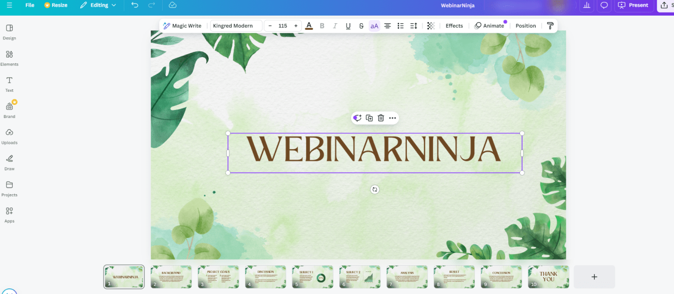
Customizing the template is easy once you nail down the colors you want people to associate with your brand. You can click to select the entire slide, and a square color wheel will appear in the top left.
Click the color wheel to play with the overall scheme, and change each color in the template’s scheme to your brand’s palette.
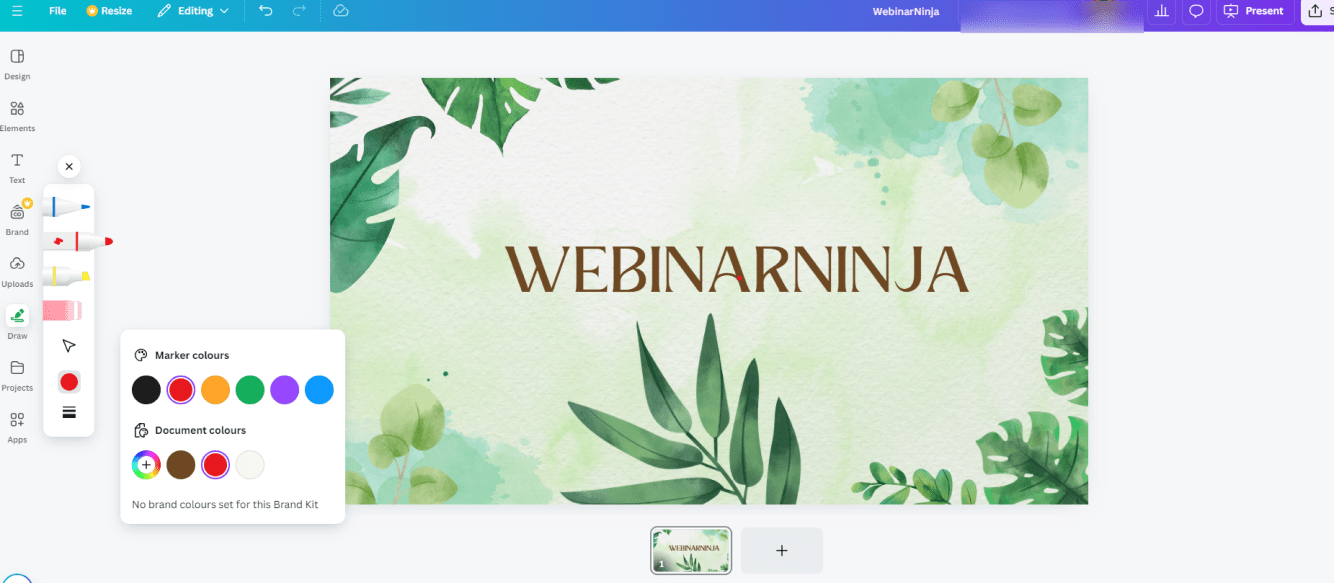
You can also click on each element in a slide: text, shapes, you name it. For photos, you can’t change the inherent color scheme. However, you’ll see a range of effects, filters, and more. You can even use color overlays or give images transparency for a multi-layered look.
We also recommend adding a small logo to the bottom corner of each of your slides. This maintains your brand’s presence in attendees’ minds, even as they learn other things from your webinar. It’s also smart if you plan to convert your slides into a downloadable “Handout.”
Step 3: Structure the Presentation
Before you start adding content and details, it’s crucial to set up the overall outline of your presentation. This is another place where Canva’s interface lends a helping hand.
You’ll see that when you choose a presentation template, several different types of slides (or “pages” in Canva terms) will be within the template. For example, there may be a title slide, an “about me” slide, a testimonials slide, etc.
You can choose to follow the pattern laid out in the template by clicking “Apply all pages,” which will lay the whole presentation out exactly as created by the designer (don’t worry; you can always add, remove, or move the slides around). You can also choose each slide for your presentation one at a time.
So, what should your presentation’s structure and your webinar’s structure be?
The short answer is it depends on the webinar.
We get into the nitty-gritty on several types of webinars in our post webinars that convert, which walk you through different types of presentations for building authority, nurturing leads, sales, etc. But generally, there’s a flow that works for most marketing/sales-oriented webinars:
- Title
- Outline
- About
- Content
- Testimonials
- Call to Action/Offer
- Testimonials
- Q&A
- Thank You
When it comes to your slides, we recommend using a different slide/page type for each section (Title, Outline, etc.). This way, your audience will be more engaged. Variety is always key to keeping people’s attention!
This is why it’s important to establish your brand’s look and color scheme. Because you’ll vary the layout of the slides for each different section of the presentation, a consistent branded look will tie it all together and make the presentation cohesive.
You can read more about great webinar presentations here, and keep the following important tips in mind:
Go big on the title slide. It’s the first thing your audience will see, and it needs to say a lot before you say anything.
Spend some time on it, even more time than you spend on the other slides. Really explore Canva’s features to turn your chosen template into something that sets the right tone — whether that’s professional, fun, nurturing, or whatever your brand stands for.
Check out a few of our favorite title slide examples from Canva’s presentation templates:
- Use the 5 x 3 Method. Remember, teaching is the new marketing and selling. That means you want your attendees to come away with new knowledge — even if it’s just knowledge about your product or service.
Break your presentation down into 5 main points, or steps. Then break each main point or step into 3 sub-points or sub-steps each.
This will make it much easier for your webinar attendees to engage, digest, and (most importantly) do something with the information you give them. Teach people something that empowers them or gives them a little win, and you’ll create customers.
- The fewer words, the better. The majority of the words need to come from you, not the slides. Don’t make people read, and don’t read to them. That’s what blog posts are for, not webinars!
Your Canva webinar presentations should be a guide, a roadmap that keeps you and the audience on the same page. It should support and illustrate what you say, not say what you say! By keeping the word count to a minimum, you bring the audience into a conversation rather than giving them a lecture.
And speaking of words…
- Use simple fonts. A webinar is not a Times New Roman situation. That’s not to say you have to live in an Arial world, but the most important thing your font needs to be is legible.
- Use “white” space. It may not literally be white, but the more space you put around words, images, data, or whatever else you want people to focus on, the better. Our eyes naturally settle on the island in the sea.
- Interpret data. Too often, we see presentations where the host offers valuable, relevant data that really makes a strong, persuasive point. The problem is they expect the audience to arrive at that point by themselves.
If you’re going to include a chart, graph, or any other statistical element, it needs to support a point, not suggest one. Be sure to write in bold, clear terms what the data means.
For example, don’t just show a pie chart that shows how 70% of people who use crash diets regain the weight they lose (I made that stat up, btw). Show the chart, but include the text “CRASH DIETS DON’T WORK” or “CRASH DIETS WORK — FOR A MINUTE.”
When in doubt, spell it out!
- Keep a consistent tone. Is your webinar funny? Serious? Professional? Soothing? Whatever you want people to feel, make sure your slides reflect it in both visuals and text.
For example, there’s nothing wrong with including a little humor in professional Canva webinar presentations — as long as it’s natural and in the same tonal context as the rest of the presentation. But sometimes, we’ll see a goofy image halfway through a presentation, clearly wedged in because someone thought it would “lighten things up.”
It’s usually pretty cringeworthy.
Even the design of the slide can strike the wrong tone. Having artsy, whimsical brushstrokes or scribble shapes is perfectly appropriate if you’re setting a fun tone for a presentation about design. But it undercuts your message if the presentation is a business pitch.
Step 4: Add Some Pop
You have the structure, the content, and a beautifully branded, professionally designed presentation template.
Now, it’s time to spice things up. Here’s how:
Add multimedia. Both Canva and WebinarNinja allow you to add video to your presentations — and you should. For live webinars, you don’t want to use anything too long; just a few minutes of video content is enough to raise engagement.
Not sure what kind of video content to add? Video testimonials from happy customers is always a safe bet!
Add animations. Canva has a treasure trove of animated illustrations, symbols, and other images under the “Elements” tab. You don’t want to overdo it, but a few strategically placed animations can grab attention and highlight the most important points of your webinar.
Leave space for other voices. It’s always a great idea to give the floor to someone other than yourself during a webinar. Here are two great ways:
- Reserve a slide for a special guest to join you “on stage” as a co-presenter. This can be a loyal customer, another expert in your field, or another entrepreneur in a related niche (fitness coaches can bring on nutrition experts, for example).
For ” their ” slide, just put your special guest’s name, credentials, URLs, logos, or other branding material the guest provides.
- Invite an attendee “on stage.” Create a slide that prompts your audience to share their experience or volunteer for a quick one-on-one lesson (for example, yoga or meditation teachers can briefly coach someone on their posture).
Creating effective slide presentations used to be kinda like creating effective webinars: a huge pain. Fortunately, the tools are getting better, easier to use, and frankly, more fun.
Ready to Wow Your Audience With Canva Webinar Templates?
Canva webinar templates can significantly enhance your presentations, making them visually appealing and engaging. These templates are designed to captivate your audience so that your content stands out. You can also customize these templates to fit your brand and deliver a professional and polished webinar that leaves a lasting impression.
You can also use a robust webinar tool like WebinarNinja, which offers features like high-definition video, interactive polls, and customizable templates. Combining Canva’s design prowess and WebinarNinja’s advanced features will surely create a fantastic webinar experience for your audience.
Want to host a webinar for free?
Use WebinarNinja to teach, improve marketing, and grow your sales.