Your webinar landing page is the bridge between “someone who clicked” and “someone who registered.” It has roughly 8 seconds to communicate value, earn trust, and push a visitor toward that sign-up button. A poorly designed page, no matter how good your webinar actually is, bleeds registrations silently every day.
The good news is that this is one of the most fixable problems in marketing. A sharper headline, a better-placed CTA, or a single piece of social proof can swing your registration rate dramatically. Webinar landing page conversion rates can reach as high as 51%, while the average sits around 22.84%, meaning there’s real room between where most pages perform and where the best ones land.
In this guide, you’ll find 20 real webinar landing page examples from brands that are getting it right. Whether you’re creating your first webinar registration page or trying to squeeze more sign-ups out of an existing one, the examples and tactics ahead are built to give you a clear path forward.
What Makes a Webinar Landing Page Convert?
A high-converting webinar landing page needs:
- a benefit-driven headline
- a CTA visible without scrolling
- social proof, such as testimonials or registrant counts
- a short registration form, name, and email, if possible
- a presenter bio
- a countdown timer for urgency, and
- a mobile-responsive layout
Once you’ve got these fundamentals in place, refer to this guide for step-by-step help building your webinar registration page from a blank start. Now let’s look at 20 real pages putting these principles into practice.
20 Webinar Landing Page Examples That Work (And Why)
The 20 pages below were selected because each one demonstrates at least one deliberate, high-impact design or copy decision worth understanding and applying to your own registration pages.
Rather than just showing you what they look like, we’ll show you exactly what each page does well, and the specific principle behind it that you can steal.
1. WebinarNinja
WebinarNinja’s registration pages are built on the idea that a well-crafted landing page drives sign-ups. Fully customizable templates combine with your branding to produce unique pages that convert, all built around the platform’s core promise: generate leads, grow sales, and teach better.
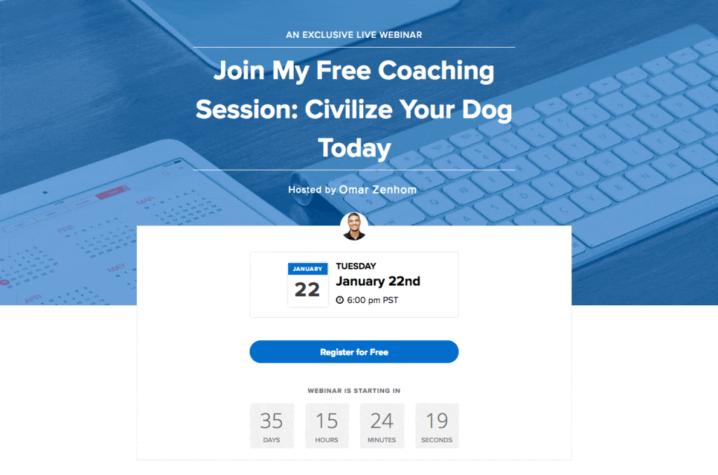
A strong, benefit-led headline sits above the fold alongside the CTA, followed by the date, time, and a quick preview of what attendees will learn. Smart, AI-assisted automation works quietly in the background, timing reminders and follow-ups, and even offering placements based on how each visitor actually engages, so pages aren’t just well-designed; they’re built to convert. A countdown timer adds urgency as the session approaches.
For step-by-step guidance on building your own, refer to this guide on creating webinar registration pages.
Why Use This Landing Page Design?
- Headlines built to grab attention and communicate the webinar’s value fast
- A landing page builder with proven, pre-designed templates, no coding needed
- AI-assisted automation that adapts reminders and offers to attendee behavior
- Flexible branding options for a page that looks and feels like your own
Here’s a quick video to help you understand how to create the most lucrative landing pages for webinars:
Want to host a webinar for free?
Use WebinarNinja to generate leads, improve marketing, and grow your sales.
2. HubSpot
This webinar series landing page for advertising by HubSpot relies on multimedia elements. It promises quality webinar content with engaging videos.
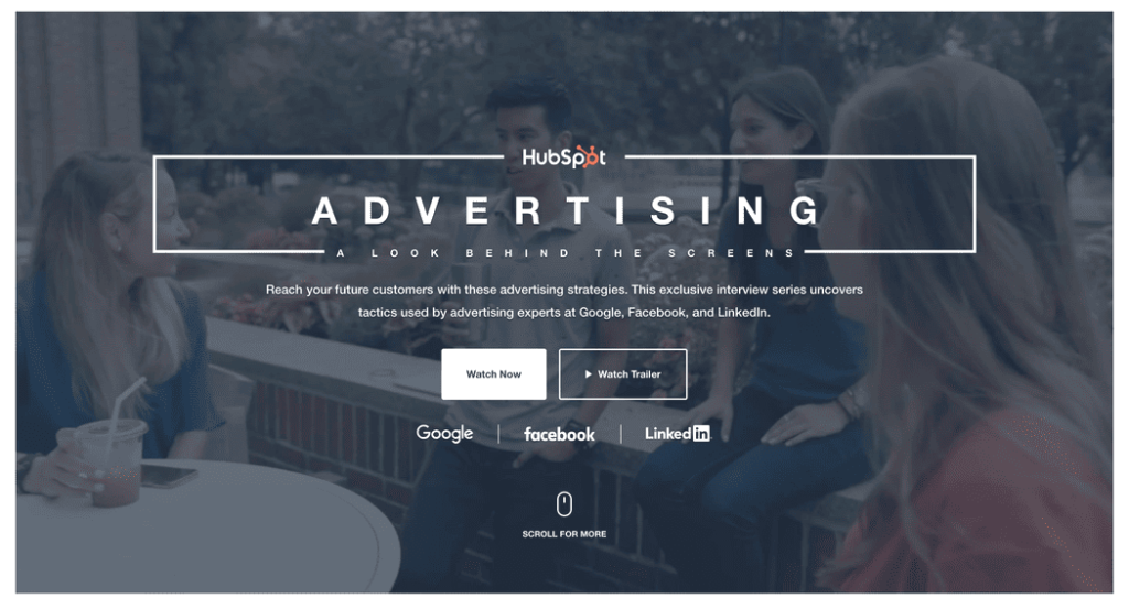
The landing page is a classic example of how you can lean into the visual experience of your page by designing it creatively.
You can use it as a landing page template for advertising purposes.
Why It Works: Leaning Into the Visual Experience
- Well-designed to attract potential attendees
- Provides relevant information about a webinar
- Encourage greater sign-ups
3. Unbounce
The webinar registration landing page by Unbounce is full of confidence. The page can help businesses drive registrations for their webinars by providing a seamless and optimized experience for visitors.
The section on what visitors will gain by registering for the webinar is eye-catching. It demonstrates the value potential participants will get from the webinar.
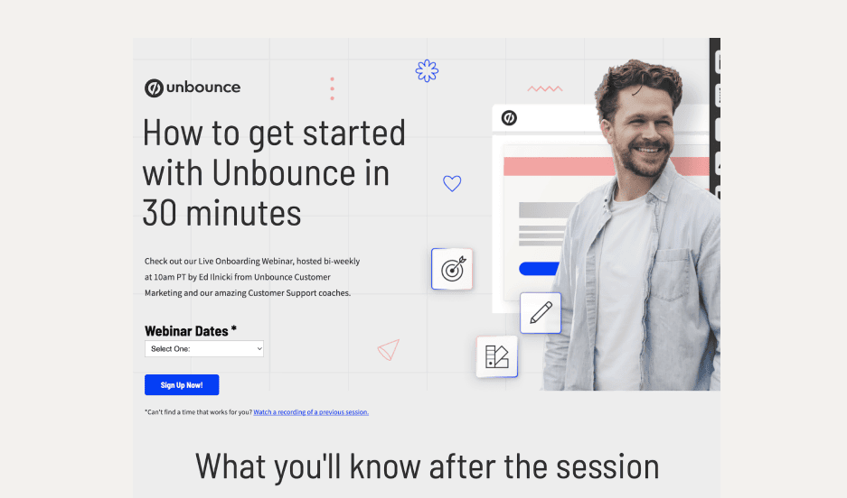
This webinar landing page example provides the basic necessary information quickly, plus access to previous webinar recordings in case visitors can’t make it to the live one.
Why It Works: Clarity About What Attendees Will Gain
- It focuses on critical elements essential for driving conversions
- An attention-grabbing headline that clearly communicates the webinar’s value
- Highlights of the key benefits attendees will gain from participating
4. Airbnb
Nothing can be more exciting than becoming a host at this popular and widely used vacation rental company. By using this webinar landing page template, you can create introductory webinars that teach people how to set up a listing and become a host.
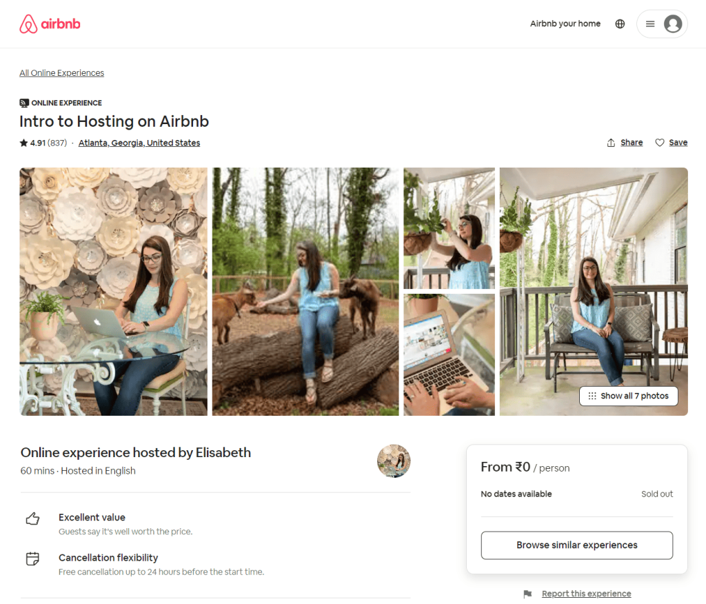
The landing page is marked by a short and clear headline. It also introduces the host of the webinar to visitors, besides giving two clear options for participation. Testimonies by previous guests enhance the credibility of the page.
Why It Works: The Personal Touch That Builds Trust
- There is a personal touch to how the whole page is set up and presented
- It has kept each section simple and easy to understand
- Social proof by incorporating reviews from previous webinar attendees
5. Tailwind
Tailwind’s webinar landing page on Instagram strategy is led by a call to action at the top. It also presents what attendees can expect at the end of the webinar.
The landing page has been kept short and simple with just the above sections, an expert testimony, and something about the host.
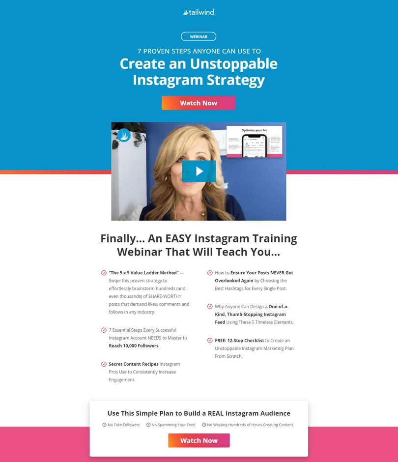
The focus is entirely on the target audience – what they will get out of the webinar, and there’s no hard selling about the company.
Why It Works: Audience-First Copy With Zero Hard Selling
- Focused on simplicity and effectiveness
- A visually pleasing image or video reflecting the webinar topic
- Visually distinct and strategically placed CTA buttons
6. Bandzoogle
This online platform for musicians maintains a straightforward and above-the-fold webinar landing page. The headline is clear and helpful.
The page consists of the webinar title, what attendees will learn, who the hosts are, an email sign-up space, and a CTA. That’s it. There is no overdose of copywriting seen here.
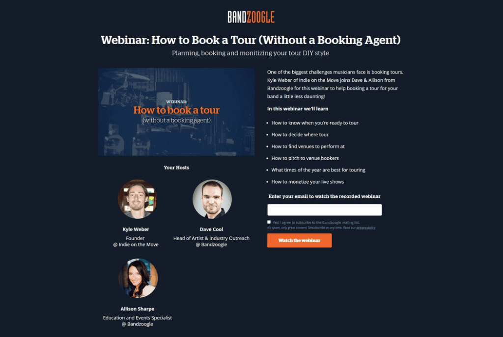
You can leverage this landing page style to promote your short-term events.
Why It Works: Above-the-Fold Simplicity Built for Mobile
- Clean and simple design
- Clear and compelling messaging
- Focuses on the essential information & removes any distractions
This above-the-fold-only layout is particularly effective on mobile, where scroll fatigue dramatically reduces form completions. A visitor arriving on a 375px phone screen sees the headline, the value, and the CTA without having to touch the screen. That’s the ideal state for any registration page, and Bandzoogle achieves it with remarkable restraint.
7. INBOUND
INBOUND’s webinar landing pages make it easy for users to register for a webinar event or gain access to a recorded webinar.
What makes its landing pages unique is their focus on delivering a seamless user experience. They prioritize user-friendly design, making it easy for visitors to navigate the page and find the information they need to make a decision to register.
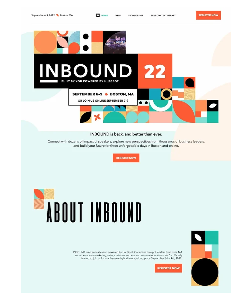
Compelling visuals, informative content, and clear calls-to-action create a sense of urgency and encourage visitors to take action.
Why It Works: Multiple CTAs That Don’t Let Visitors Escape
- User-focused design
- Colorful page designs that capture visitors’ eyes and draw them
- Multiple CTAs are placed throughout the landing page to ensure they’re not missed
8. LinkedIn Learning
As you can see, LinkedIn Learning presents a comprehensive and informative landing page for its video courses, like the above.
This unique feature sets the online platform apart.
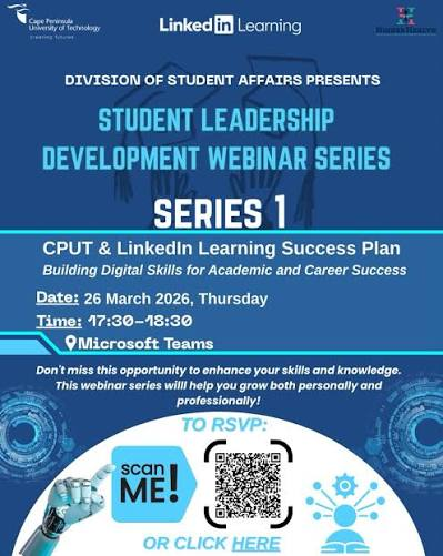
The landing pages often include user ratings and reviews for the course. This feedback provides valuable insights from learners who have already taken the course, helping prospective learners gauge its quality and effectiveness.
Why It Works: Using Peer Reviews as Registration Fuel
- Detailed course information to quickly understand what the course is about
- Short course previews to get a glimpse of the course content and teaching style
- Related courses to help learners achieve specific learning objectives through a set of courses
9. The New York Times
The on-demand webinars offered by The New York Times cover a wide range of topics, including teaching resources, accessible journalism formats, and special topics.
Landing pages by the newspaper often showcase a combination of featured articles, news stories, opinion pieces, multimedia content, and relevant advertisements.
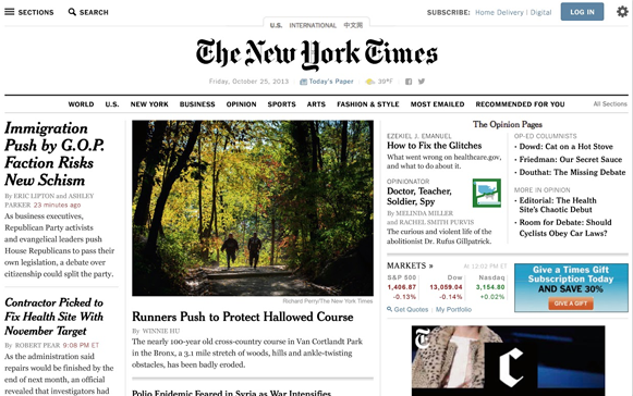
Its focus on educational content makes these pages and the ensuing webinars particularly valuable for teachers and other education professionals.
Why It Works: On-Brand Design That Feels Native to the Publication
- On-brand CTAs are linked in the copy, but they are still prominent and easily spotted
- These landing pages look like other pages on the newspaper’s website, like a news article itself
- Classic newspaper style with headings, subheadings, and bulletins
10. Canva
Canva is an online design and visual communication platform. It has designed its webinar landing pages with brevity in mind. They are in short form and designed to capture visitors’ attention quickly and guide them toward taking a specific action.
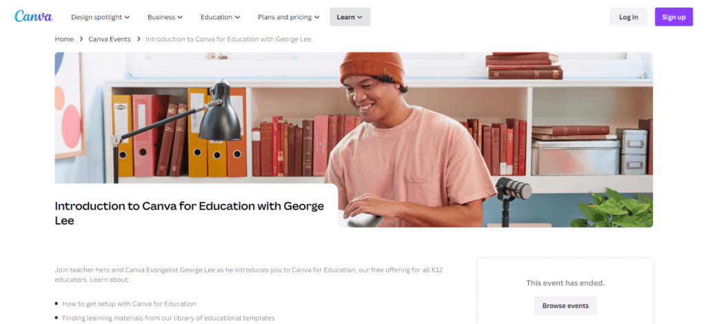
In the example page image above, you can see that it contains only the webinar title, what attendees will learn, speakers, and available sessions.
Right after that, you can register for the webinar. Canvas keeps things as simple as that.
Why It Works: Radical Simplicity With a Dropdown for Flexibility
- A minimalist approach to landing page design
- Colorful stock pictures that make a landing page more lively
- A dropdown for webinar sessions on multiple days and times
11. Sprout Social
A provider of an all-in-one social media management platform, Sprout Social also follows a simple layout and design for its webinar landing pages.
Its landing pages are clean and modern, and they get straight to the point by employing a clear value proposition.
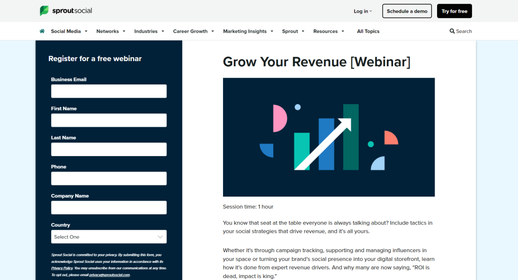
The prominent form on the left requests attendees’ details to watch the webinar.
Why It Works: Left-Aligned Form for Immediate Action
- Visually appealing and easy to read
- Clear headings & sections for easy understanding of the purpose and value of a webinar
- Attendees can make up their minds quickly about whether the webinar aligns with their interests and needs
12. Vyond
Vyond is an animated video creation platform, and understandably, the most striking part of its landing pages for webinars is the animated elements.
These animations capture the attention of visitors and make the landing page visually appealing.
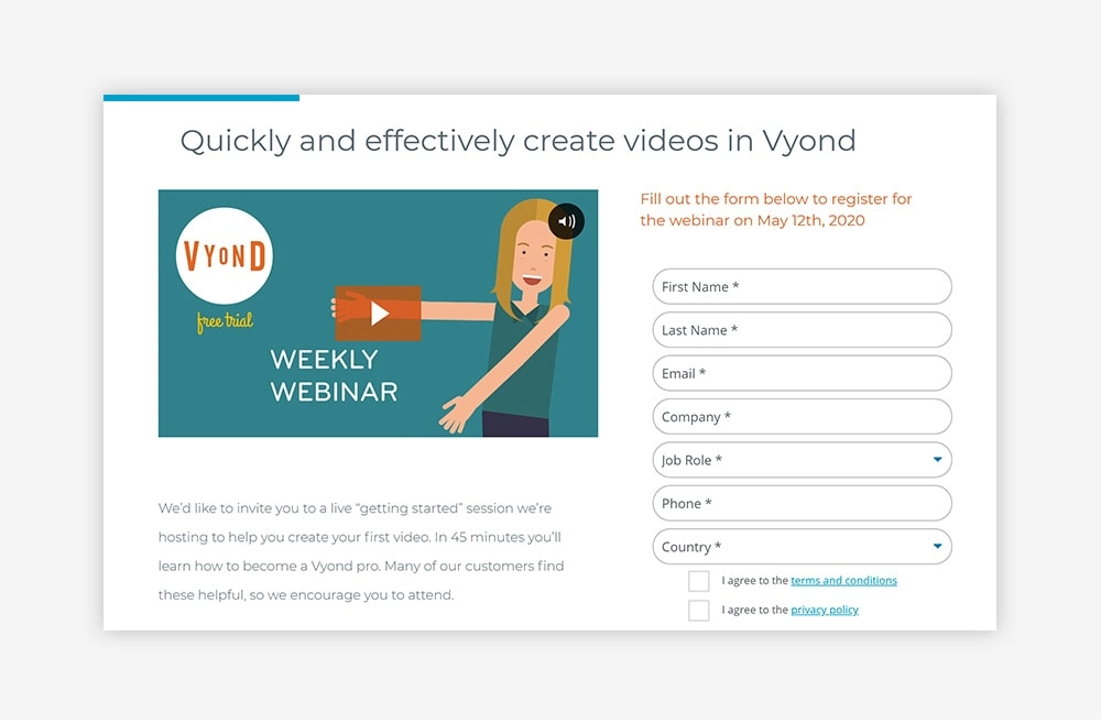
Like many thoughtfully designed pages, Vyond’s webinar landing pages keep things to a minimum with only a summary of the webinar and a sign-up form.
Why It Works: Animation That Demonstrates the Product While Building Trust
- Trust-building animated videos
- Clear headline
- Polished look for making a great first impression on potential attendees
13. MailChimp
MailChimp’s webinar landing pages are known for their professional and inviting look.
The webinar title and signup form are always visible without the need to scroll. This approach is effective in capturing the attention of visitors and encouraging them to take action.
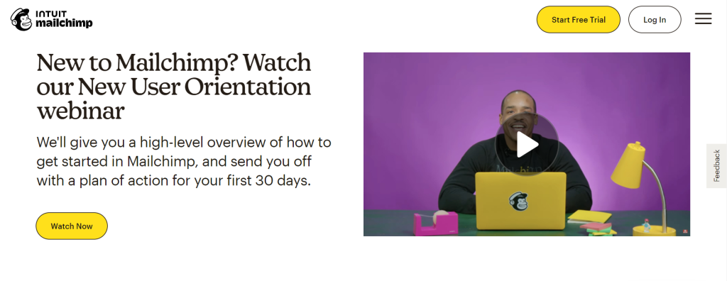
The new user onboarding webinar shown above is placed at the top of the landing page with a summary below. Attendees can also register for more related webinars further down the page.
Why It Works: Above-the-Fold Title and Form That Never Disappear
- A professional design with high-quality images, appealing typography, and a well-thought-out color scheme
- Above-the-fold content for enhanced visibility & easy access to essential information
- The webinars can be accessed online from any location, whether they are live-streamed or pre-recorded
14. Wix
If there’s one word that best describes webinar landing pages by Wix, it is pure simplicity. Its landing pages are designed to be user-friendly and easy to navigate, ensuring a seamless experience for both the presenter and the attendees.
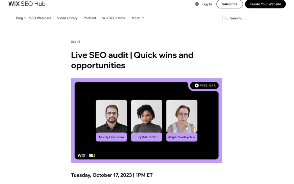
A streamlined design ensures a clean and minimalist layout that focuses on the essential components of an event, such as the title, date, time, and sign-up button.
By removing unnecessary distractions, the landing pages give a clear and straightforward interface, making it easy for visitors to understand the purpose of the webinar and take the desired action.
Why It Works: Drag-and-Drop Simplicity That Puts Hosts Center Stage
- Intuitive customization options via a drag-and-drop editor
- Sufficient space dedicated to showcasing the hosts’ bios
- The landing pages are designed to incorporate SEO best practices
15. WordPress
WordPress provides some of the best “getting started” webinars for free. After the webinar title and a one-liner, the landing pages highlight the features of the webinar and other details.
After this, you’ll find the full description and the topics covered.
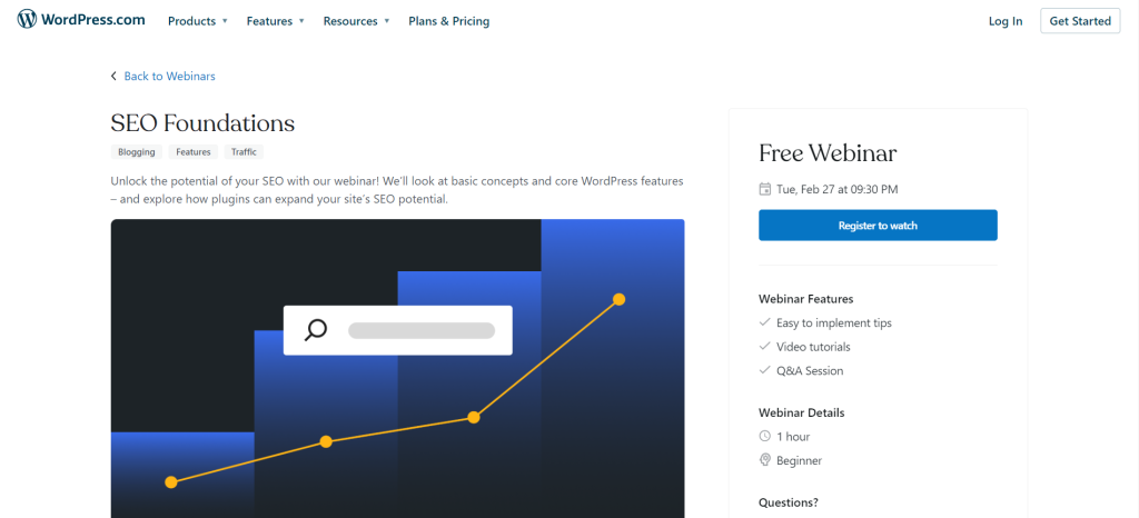
There is also a recording of one of its recent presentations of the webinar in question.
Helpful resources and a link to its community are other key elements.
Why It Works: Resource Density That Makes the Page Bookmark-Worthy
- You can easily find the next webinars and self-paced courses on the same page to learn the basics or dive deeper with live expert sessions
- Descriptive information in a consolidated form, so that interested visitors find everything in one place
- Links to additional resources that provide more details about the webinars
16. Calendly
This webinar landing page by Calendly is designed to help users get started with the meeting scheduling platform. The page provides a clear and concise overview of information, including the availability of the webinar, its length, and the topics covered.
The page is structured in a way that highlights the features and benefits of Calendly, as well as gives users a clear understanding of what they can learn from the webinar.
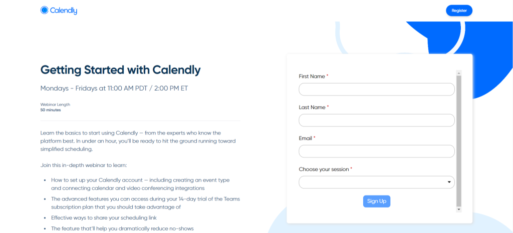
The inclusion of a Q&A chat box suggests that participants will have the opportunity to interact with product specialists and get their questions answered, which adds value to the webinar experience.
Why It Works: Pain-Point Framing That Speaks Directly to the Reader
- The page provides a clear outline of the topics covered to quickly determine the relevance
- Addresses common user pain points, such as sharing availability and setting up Event Types, which resonate with the target audience
- The mention of learning directly from experts implies that the webinar will provide valuable insights and best practices for using Calendly effectively
17. Adobe
What visitors notice first in Adobe’s landing pages for on-demand webinars is its comparatively long sign-up form. This indicates that the company intends to make its forms the main focus of the pages without wasting any time on lengthy descriptions.
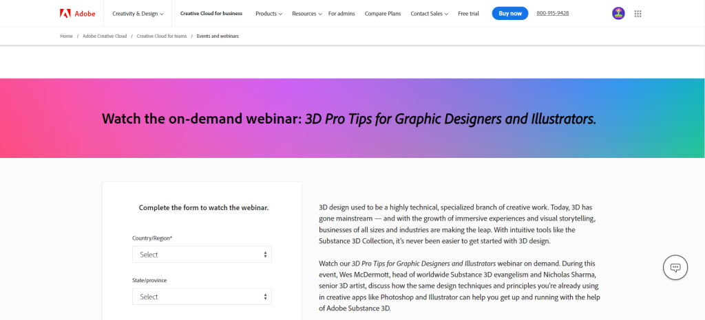
Apart from that, the pages contain all the essential information, such as something about the webinars, what attendees will learn, and who the speakers are.
Why It Works: Form-Forward Design That Skips the Warm-Up
- Future attendees are taken to the form directly and quickly to take action
- A professional look and feel that builds trust and credibility with potential customers
- Maximized usability for visitors to engage with the pages effortlessly
18. Gartner
Gartner’s webinar landing pages are just the opposite of Adobe’s. It gives information about the webinar topic, what type of webinar it is, the duration, and a detailed description.
But what makes Gartner’s pages different is that it has kept its webinar registration form relatively small.
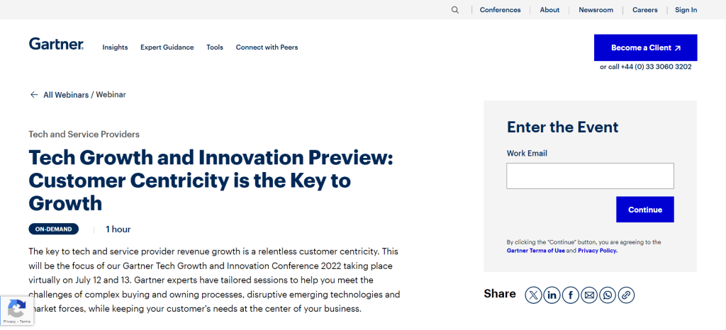
Prospective participants are required to share their work email to enter an event.
There is also a social share button to share a webinar with visitors’ social networks.
Why It Works: Reducing Friction to a Single Email Address
- Interested individuals only need to provide their email address, and by continuing, they get access to the rest of the sign-up form
- The forms feature a progress bar that encourages visitors to complete the entire process
- Detailed information on what visitors can expect from the webinars
19. Google Digital Garage
Google Digital Garage is a free online platform created by Google to provide individuals with digital skills training to help them grow their careers or businesses.
Its webinar landing pages are designed to incentivize users to sign up for digital marketing courses, Google AdWords, SEO, and social media training.
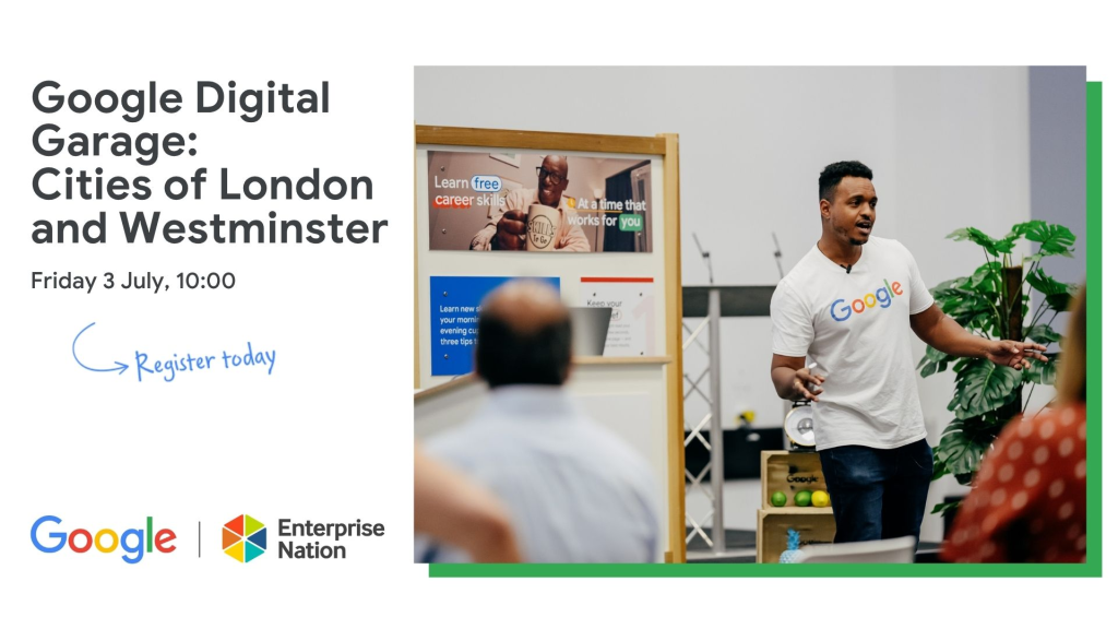
These landing pages are designed in a way that draws users’ attention to the course or webinar being offered and encourages them to register. They typically use eye-catching images or videos that spark interest, concise headlines that communicate the value proposition, and brief descriptions that give users a clear understanding of what to expect.
Why It Works: Equal Visual Weight Between Content and Form
- Information about the webinar and the registration form are of the same size; no disproportionate look
- In addition to what attendees will learn, there is “good to know” information added at the end
- Brief and quick to read for anyone interested
20. Kapost
This leading provider of content marketing software has pulled off a completely different webinar landing page style.
With a predominantly blue background, the landing page design above stands out for its heading. It has been repeated multiple times throughout the page.
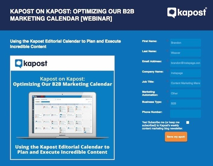
There is no information about the hosts and webinar timing but just a standard registration form on the right.
A screenshot of the Kapost calendar gives visitors an idea of how the company can help optimize their marketing calendars.
Why It Works: First-Person CTA That Creates Ownership
- The CTA “Save my spot” is in first person for a more personalized experience
- Minimal and well-separated text for easy reading and understanding
- The page actually lives out the idea that less is more
Quick Reference: What Each Example Teaches
| Brand | Industry | Standout Tactic |
| WebinarNinja | Webinar software | Native, all-in-one registration experience with a built-in countdown timer |
| HubSpot | Marketing software | Video-led, visually rich page design |
| Unbounce | Landing page software | Clear “what you’ll gain” section plus replay access |
| Airbnb | Travel/hospitality | Personal host intro and guest testimonials |
| Tailwind | Social media scheduling | Audience-first copy with zero hard selling |
| Bandzoogle | Website builder (music) | Above-the-fold simplicity built for mobile |
| INBOUND | Marketing conference | Multiple, well-placed CTAs |
| LinkedIn Learning | Online education | Peer reviews used as registration fuel |
| The New York Times | Media/publishing | On-brand design that feels native to the site |
| Canva | Design software | Radical simplicity with a session dropdown |
| Sprout Social | Social media management | Left-aligned form for immediate action |
| Vyond | Animation software | Animated visuals that build trust |
| MailChimp | Email marketing | Above-the-fold title and form that never disappear |
| Wix | Website builder | Drag-and-drop simplicity, host bios front and center |
| WordPress | Website/CMS | Resource-dense page built to be bookmarked |
| Calendly | Scheduling software | Pain-point framing in the page copy |
| Adobe | Creative software | Form-forward design that skips the warm-up |
| Gartner | Research/advisory | Friction reduced to a single email field |
| Google Digital Garage | Digital skills training | Equal visual weight between content and form |
| Kapost | Content marketing software | First-person CTA (“Save my spot”) |
How We Selected These Examples
Picking 20 pages out of the thousands of webinar registration pages live at any given time meant working against a rubric, not a gut feeling. Here’s what we screened for, and why each criterion mattered.
| Criterion | What We Looked For | Why It Matters |
| Demonstrated tactic | At least one deliberate, replicable design or copy decision, not just a page that looks polished | A page has to teach something specific, or it’s not worth including in a learning-focused list |
| Public track record | A brand running a publicly known, recurring webinar program rather than a single one-off page | Recurring programs suggest the design choices are actually working, not a lucky one-time result |
| Industry range | Coverage across software, media, education, creative tools, and B2B services | A single-industry list tells you less about which tactics generalize to your own audience |
| Complexity range | Pages spanning a 5-element stripped-back layout up to a multi-section resource hub | Both minimalism and information density can convert, depending on the traffic source and the offer |
| Traffic context | A mix of pages built for cold traffic (ads, social) and warm traffic (existing subscribers, product users) | The right amount of persuasion on a page differs based on how much the visitor already trusts the brand |
It’s also worth noting what these pages are up against. The median conversion rate across all landing page types is around 6.6%, while dedicated webinar registration pages average 22.84%. Every example on this list was chosen because it does something to earn that gap, not because it simply belongs to a recognizable brand.
Key Lessons from the Examples
Whether you’re running a single live session or building out a full webinar series, the 20 pages above point to the same handful of decisions, repeated in different forms. Here’s what each one teaches, and how to apply it.
1. A Headline That Names the Outcome, Not the Topic
Calendly’s page (Example #16) works because it names the actual pain points, sharing availability, setting up Event Types, instead of a vague topic like “scheduling tips.” The best webinar headlines follow a simple formula: specific audience + specific outcome + specific timeframe or mechanism.
“How retail store owners increased foot traffic by 34% using local SEO, without spending a dollar on ads” is more compelling than “Local SEO for Retail.” The more specific you are, the more you filter for the right audience, and a qualified registrant is worth ten unqualified ones. A/B test two headline variants whenever possible, changing only the headline and keeping everything else identical.
2. A Description That Sells the Outcome, Not the Agenda
Bandzoogle (Example #6) and Kapost (Example #20) both prove that less is more: neither page over-explains, they state the webinar title, what attendees will learn, and get out of the way. Compare that with WordPress (Example #15), which goes the opposite direction and wins by being resource-dense rather than wordy.
Your description should answer three questions: what will I learn, why does it matter, and what will I be able to do differently afterward. Use bullet points with one specific takeaway per bullet; avoid “Learn about social media marketing” in favor of “The three content formats that generate the most organic reach on LinkedIn.”
3. A Visual That Builds Trust Before the Pitch Does
Vyond (Example #12) leans on animated video to build trust and demonstrate its own product simultaneously, while Airbnb (Example #4) uses a photo of the actual host to add a personal touch. The best-performing visual on a registration page is usually a high-quality photo of the speaker, not a stock photo, since it humanizes the webinar before the event even happens.
If you have a recording of a past webinar with strong production quality, a short clip embedded on the registration page can meaningfully increase time on page and trust.
4. Social Proof Placed Where Cold Traffic Will Actually See It
Airbnb (Example #4) and Sprout Social (Example #11) both put testimonials or a clear value statement above the scroll line rather than burying it at the bottom. This matters because 92% of consumers read reviews and testimonials before acting on an offer from a brand they don’t already know.
Place your strongest testimonial, ideally one that names a specific outcome, directly below the headline and CTA. If you have a registrant count, display it dynamically near the CTA: “Join 1,400 others who have already registered.”
5. A Presenter Bio That Earns Attention Instead of Assuming It
LinkedIn Learning (Example #8) leans on peer reviews and instructor credibility to do the trust-building work, which matters even more if your webinar is meant to train and communicate with a skeptical or technical audience.
The bio’s only job is to answer the question, “Why should I listen to this person?” Instead of “John is a marketing expert with 10 years of experience,” write “John has helped 240+ SaaS companies reduce churn by restructuring their onboarding.” Specificity is credibility.
6. A CTA Written in the Attendee’s Voice
Kapost’s (Example #20) first-person “Save my spot” outperforms third-person phrasing because it reduces the psychological distance between reading and acting. If your webinar’s real goal is lead generation rather than pure attendance, frame the CTA around what the visitor gains access to, not just what they’re signing up for.
Use one primary CTA above the fold and repeat it at the bottom of the page for visitors who read everything before deciding.
7. A Form That Asks for Almost Nothing
Gartner (Example #18) and Adobe (Example #17) sit at opposite ends of form philosophy, and Gartner’s single-email-first approach with a progress bar is the one worth copying. Reducing even one form field can increase conversions by up to 50%. Whatever integrations push that registrant data into your CRM or email tool, keep the form itself down to name and email.
8. A Countdown Timer That Makes the Deadline Real
WebinarNinja’s own registration pages (Example #1) build the countdown timer natively into every page, and it’s one of the highest-leverage, lowest-effort additions available, whether you’re running a single live event or a recurring automated webinar.
A countdown showing “Starts in 14 hours, 22 minutes” shifts visitor psychology from “I’ll get to this” to “I need to decide now.” The effect is most pronounced in the final 24–48 hours before an event.
Lessons at a Glance
| Lesson | Example Cited | Action to Take |
| Headline names the outcome | Calendly (#16) | Lead with the specific pain point, not the topic |
| Description sells the outcome | Bandzoogle (#6), Kapost (#20), WordPress (#15) | Match the description length to how much convincing your audience needs |
| Visual builds trust early | Vyond (#12), Airbnb (#4) | Use a real speaker photo or short clip, not stock imagery |
| Social proof sits above the fold | Airbnb (#4), Sprout Social (#11) | Place your strongest testimonial directly under the headline |
| Presenter bio earns attention | LinkedIn Learning (#8) | Replace vague credentials with a specific, quantified outcome |
| CTA speaks in the attendee’s voice | Kapost (#20) | Use first-person phrasing like “Save my spot” |
| The form asks for almost nothing | Gartner (#18) | Cut every field beyond name and email |
| The countdown timer makes the deadline real | WebinarNinja (#1) | Add a live timer, especially for the final 24–48 hours |
Before we end this, here’s a quick video on how to get more webinar registrants and attendees:
Want to host a webinar for free?
Use WebinarNinja to generate leads, improve marketing, and grow your sales.
Ready to Build a Webinar Landing Page That Actually Converts?
A great landing page for webinars isn’t about following a visual template or copying what a well-known brand does. It’s about understanding why specific design decisions drive conversions, and making those decisions deliberately on your own page.
The common thread across every example in this guide: clarity wins. The pages that convert best are the ones that communicate the clearest value to the most specific audience, remove every unnecessary obstacle between interest and registration, and give visitors a concrete reason to act now rather than later.
If you’re building your registration page from scratch or redesigning an existing one, start with the headline. Get it specific, make it outcome-oriented, and test it against your current version. Then work your way down the page: CTA placement, form length, social proof, presenter bio, and countdown timer. Each of these is a variable you can test and improve independently.
WebinarNinja handles the technical side of all of this natively, from building the best webinar registration pages to the countdown timer to the embeddable form to the thank-you page redirect. It offers a free trial that gives you full access to the registration page builder, countdown timers, embeddable forms, and analytics.
Frequently Asked Questions
How long should a webinar landing page be?
A webinar landing page should be long enough to answer the questions a visitor needs resolved before registering, and no longer. A short page may work when the audience already knows your brand, the topic is simple, or visitors arrive from a highly targeted email campaign. A longer page tends to perform better for cold traffic, paid campaigns, complex topics, paid webinars, or events featuring unfamiliar speakers..
Should I create different landing pages for live and on-demand webinars?
Yes, because visitors are making different decisions. A live webinar page should emphasize the date, time, time zone, live interaction, limited availability, and the chance to ask questions. An on-demand page should focus on immediate access, recording length, topics covered, and what viewers gain by watching now. Avoid artificial urgency on an on-demand page unless access genuinely expires.
Should I tell visitors that a webinar replay will be available?
Mention the replay only when you know one will actually be provided. Promising a replay can increase registrations from people who can't attend live, but it may also reduce live attendance. To preserve the value of showing up live, explain what live participants get that replay viewers may not, such as Q&A access, worksheets, demonstrations, or a limited-time bonus. A useful line: "Register even if you can't attend live, and we'll send you the replay."
What should I test first if my webinar page is not converting?
Start with what visitors see before scrolling: the headline and promised outcome, the clarity of the topic, the visibility and wording of the registration button, the number of form fields, and the date, time, and time-zone information. Test one major change at a time. If several elements change together, you may improve the page without learning which change actually produced the result. WebinarNinja'sfree courses walk through a testing sequence in more depth if you want a structured starting point.
How can I diagnose why visitors leave without registering?
Review the page by traffic source and device rather than relying only on the overall conversion rate. A low mobile conversion rate may point to layout, loading, or form usability problems, and it's a common culprit:53% of mobile visitors abandon a page that takes longer than three seconds to load. Strong email traffic but weak paid-ad traffic may mean the page assumes visitors already know the brand. A high number of form starts but few completions usually means the form is too long. Session recordings, form-completion data, page-speed reports, and short visitor surveys can help reveal the cause.
What should happen immediately after someone registers?
Send registrants to a confirmation page that clearly tells them their registration was successful, with an add-to-calendar option, the date and time in the correct time zone, instructions for joining, information about the replay, a way to submit questions in advance, and one relevant next step, such as a worksheet. Avoid presenting several unrelated offers immediately after registration; the first priority is helping the registrant remember and attend the event.
How can a landing page improve webinar attendance, not just registrations?
Set clear expectations before people register: who the event is for, what will be covered, how long it will last, and what participants can do afterward. After registration, reinforce the commitment with a calendar link, confirmation email, reminder sequence, speaker introduction, and a useful pre-event resource. Once the page has done its job, the same discipline matters when youhost the webinar itself. A smaller group of well-qualified registrants is often more valuable than a large group with little intention of attending.
What trust information should appear near the registration form?
Explain what happens after someone submits the form, whether they'll receive reminder emails, a recording, or additional marketing messages. Include a link to your privacy policy and avoid requesting information that isn't necessary for registration. When asking for details such as a phone number, company size, or job title, explain why you need them or make them optional.
Can I use one webinar landing page for several audience segments?
You can, but a single generic page may weaken the relevance of the message. When different audiences have different problems or goals, create separate versions with audience-specific headlines, examples, benefits, and testimonials, while the webinar itself stays the same. For example, a webinar about employee training could use one page for HR leaders and another for compliance managers, each highlighting the outcomes most relevant to that group.
What should I copy from the webinar landing page examples in this guide?
Copy the underlying principle, not the visual design alone. For each example, identify the specific reason it works, a clear outcome, a short form, strong speaker credibility, a prominent CTA, useful social proof, or a simple mobile layout, then adapt that principle to your audience, offer, traffic source, and brand. For a closer look at how real companies structure the funnel beyond the landing page itself, thesecase studies are worth a look.
Want to host a webinar for free?
Use WebinarNinja to teach, improve marketing, and grow your sales.