
Live or automated, your our webinar presentation slides are the heart of your webinars.
It’s the roadmap for your whole presentation. It keeps you grounded, on track, and moving steadily towards the goal (that’d be sales conversions).
So, let’s nail it.
Based on my experience with WebinarNinja, let’s explore the structure, key elements, and flow of a slide presentation that keeps the audience enraptured.
6 Steps to Create Webinar Presentation Slides
These webinar presentation tips will benefit both presenters and the audience by ensuring that webinars are informative, engaging, and impactful.
1. Find a Relevant Topic to Cover
“The secret of getting ahead is getting started.”
The first step is to choose a topic that is relevant and interesting to your target audience. Consider their needs, challenges, and interests to ensure the content is valuable to them.
You can conduct market research, analyze trending topics, or seek feedback from your audience to identify a topic that will resonate with them.
For example, if you are hosting a webinar for a marketing audience, you might choose a topic like “Mastering Social Media Marketing Strategies” or “Building an Effective Email Marketing Campaign.”
Remember, the goal is to select a topic that not only aligns with your expertise but also addresses the needs or curiosities of your audience.
Pro Tip: Use social media platforms, discussion forums, and surveys to gather insights into the topics your target audience is interested in. This can help you create a presentation that meets their expectations.
2. Determine the Outline of the Presentation
Outline the key points and structure of your presentation. Decide what information you want to cover and in what order. This will help you organize your thoughts and ensure a logical flow of content during the webinar.
The outline should clearly define the flow of your presentation, starting with an introduction of yourself and the topic, followed by the main content divided into manageable sections, and concluding with a summary and Q&A session.
The outline will ensure that the webinar is coherent and maintains the audience’s interest throughout.
What You Can Do: Use the rule of three – break your content into three main sections or key points. This will help your audience absorb and remember the information better.
Example: For a webinar on social media marketing strategies, the outline could include sections on understanding the target audience, choosing the right webinar platforms, and measuring success.
3. Decide the Template
Choose a professional and visually appealing template for your webinar slides. The template should align with your branding and enhance the overall visual experience for the audience. It should also be easy to read and navigate.
Choose a template that reflects the theme of your webinar. Many platforms provide a variety of customizable templates designed for webinars and you can select one that best fits your content.
For instance, Google Slides and Microsoft PowerPoint offer a variety of pre-designed templates to choose from. They can help you understand the different webinar presentation examples you can deploy.
Ensure the template is not too cluttered, has enough space for text and visuals, and includes a consistent color scheme and font style to maintain visual harmony. Use high-quality images or graphics.
Choose a clean design that allows the content to stand out. Make sure it conveys your brand identity.
Note: If you’re representing a corporate brand, you might choose a template with a clean and minimalist design. If your webinar is aimed at a creative industry, you could opt for a more vibrant and visually engaging template.
4. Keep Slides Light & Engaging
“If you can’t explain it simply, you don’t understand it well enough.”
Your slides should support and enhance your presentation, rather than overwhelming or distracting your audience.
Keep the text concise and use bullet points or visuals to convey information effectively. Images, graphs, or charts can make the slides visually appealing and break the monotony of text. But avoid overcrowding slides with too much text or complex graphics; add what is just required.
Remember, the slides should support your spoken content, not replace it, by highlighting key points and keeping the audience focused.
Pro Tip: Use visual elements like infographics or icons to represent complex information. Use animations sparingly to add interest to your slides without distracting from the content.
Here’s what you can do: Instead of listing detailed information about social media statistics, use a graph or chart to represent the data and highlight the key points visually.
Unsplash and Pexels offer free high-quality images that you can use in your webinar slides.
5. Include a Call-to-Action Slide
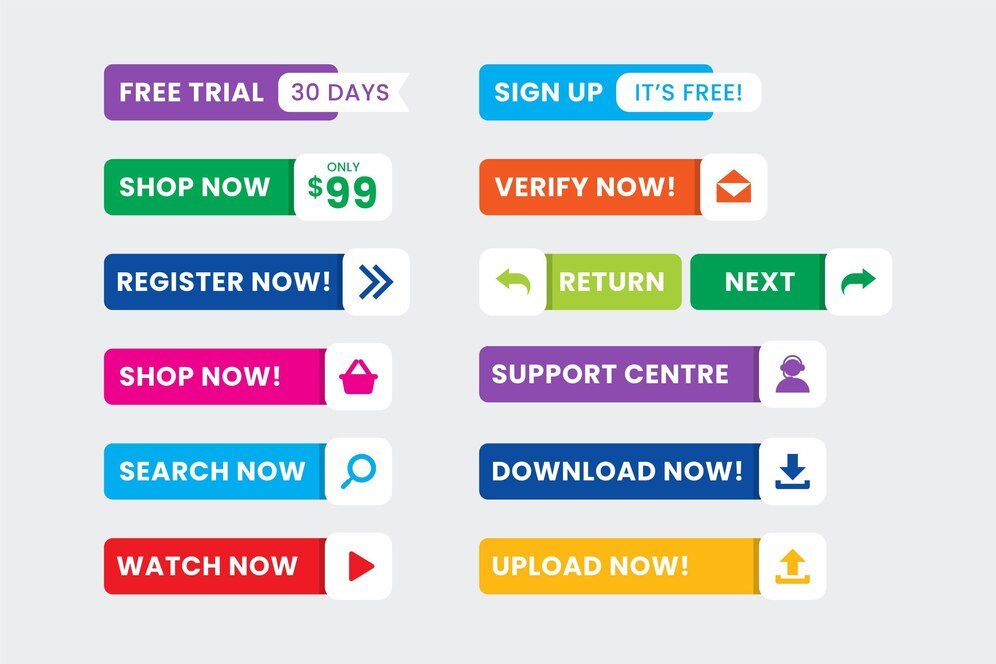
Towards the end of your presentation, include a slide that prompts your audience to take action. It could be a request to sign up for your newsletter, follow you on social media, register for a future event, or purchase a product/service.
A call-to-action (CTA) slide is crucial in a webinar presentation as it directs your audience on what to do next.
Make sure your CTA is clear, compelling, and easy to follow. Use concise language and bold visuals to draw attention to the CTA, and explain the benefits of taking the action to encourage participation. Provide the necessary links or contact information.
Example: “Sign up for our weekly marketing tips newsletter to stay updated with the latest industry trends. Visit www.example.com/newsletter to subscribe!”
6. Review Your Slides
Before finalizing your webinar presentation, it’s important to review your slides thoroughly.
Check for any typos, grammatical errors, or inconsistencies in design and content. Ensure that the flow of the presentation is smooth and logical, and that all visuals are high quality and relevant.
It’s also helpful to rehearse the presentation using the slides to ensure that the timing is appropriate and the content aligns with your speech.
Make sure all the slide transitions, animations, and visuals work as intended.
Getting feedback from colleagues or friends can also provide insights for improvement to ensure your webinar is polished and professional.
Additional Resource: SlideShare is a platform where you can find inspiring presentations and gain ideas for your own slides.
That was all about how to create a webinar presentation using slides. Continue reading for additional information on the topic.
Creating a Webinar Presentation Slideshow Flow
For maximum impact, I’d recommend that you follow this slideshow structure. It’s designed for maximum engagement, retention of information, and likelihood of follow-through on your CTA or offer.
The Webinar Title Slide
It’s First Impression time. The opening slide should have the following elements:
- The webinar title. It should be the most prominent thing, but not just because it’s the title slide. The title is your promise, the reason attendees came, the solution to their pain point.
- Your company name and logo (see the “Tips on Branding Your Slides” section below for more on that).
- Your company URL.
The Webinar “Table of Contents”
This is where you lay out exactly what attendees can expect. In bullet points, list the learning outcomes of the webinar — this is how you expand and get specific on the “promise” of the webinar title.
Ambushing attendees with an offer does not create trust. Instead, assure them that you are there to give them something first, and that 90% of the webinar will be about fulfilling what the title promises, not opening wallets.
Your “About” Slide
This is where many hosts run into trouble. It can be very tempting to babble about oneself, listing your accomplishments and “sharing your journey.” Not that you shouldn’t do those things; stating your qualifications is key to your credibility, and journey-sharing is crucial to making a personal connection.
But too much of either will quickly turn people off.
Keep this part short and sweet, and remember that most of your attendees are patiently waiting for you to deliver on the promise. They don’t give a squirrel’s tail how proud you are of yourself, or where you spent your vacation. There’s a fine line between being relatable and being off-topic.
The Meat: Creating Webinar Instructional Slides
These are the most important or interesting parts of a presentation.
Now, we often think “more is better,” and therefore, more information is more valuable. But we have to remember one thing: attendees can only use the amount of information that they can process and retain.
That means stripping it down.
As discussed in this post, your webinar should be narrowly focused in the first place. Think How to Build 10 Pounds of Lean Muscle in 6 Months, not How to Get In Shape. Beyond that, your instructional slides should be limited to what an average person can actually keep in their brain long enough to act on.
Don’t Forget the Testimonials
You can be compelling. Your instructions can be understandable and actionable. You can have experience and accolades. But nothing convinces people to buy like user reviews or social proof.
It’s the 21st century. Consumers don’t trust salespeople. They don’t even trust “influencers” and “thought leaders” that much. They trust fellow consumers. That’s why Amazon is so effective: each of its product pages includes a wealth of reviews.
In other words, don’t expect your audience to take your word for it. Give them someone else’s.
A testimonial page should include three things:
- A short quote that makes your product/service sound effective and wonderful.
- The name of the person whose quote it is (and a picture, if possible).
- The person’s company, or some other “consumer credential” that establishes the quote as credible.
Here’s an example:
“Pet Style Coach helped me take my labradoodle’s holiday sweater game to the next level, and 4 of my 6 guinea pigs can pull off black tie. Now I have TOO many offers from pet food companies.”
Bring it Home: The Offer Slide
And here it is. The part where all your webinaring literally pays off. At this point, you should have given your attendees all the value they came for, and fulfilled your promise to empower them. Now, they trust you enough to be open to an offer.
Include three things on this slide:
- The offer, in as few words as possible. “6 months of coaching for $XXX”
- A bonus. “Sign up today and get 2 months free!”
- Whatever info is needed to redeem the offer/bonus, either by following a link, entering a coupon code, etc.
Keep it minimalist and to the point. Emphasize the value of the specific offer, not the value of the product.
Q&A Slide
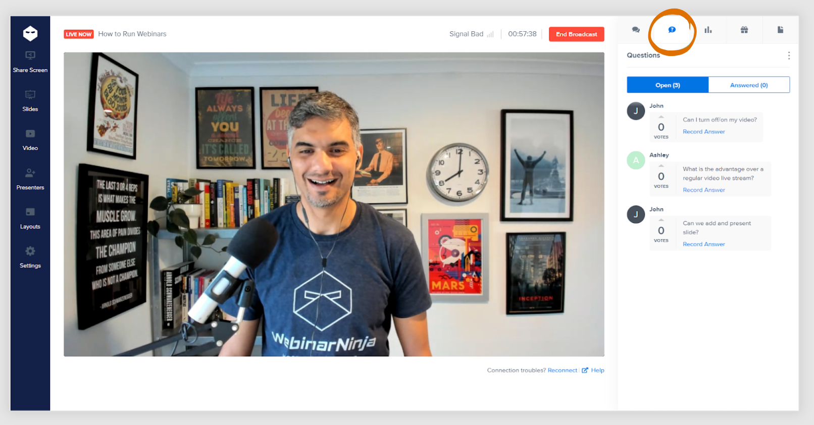
Not much to this one. Just create a branded slide to mark the point in the presentation where you open the floor to questions.
Thank You Slide
The final slide, where you express your gratitude for everyone who stayed to the end. To get the last bit of juice out of this webinar for your business, include the following:
- An expression of gratitude (“Thank you” tends to work, but feel free to get creative.)
- An email address for post-webinar questions or concerns
- Instructions for accessing the replay (live webinars only)
- Instructions on accessing your offer, again
For live webinars, the replay part is especially crucial — you’ll find a significant percentage of registrants skip the live show and convert on the replay.
Tips on Branding Your Slides
“Branding” is a nebulous concept that involves the full spectrum of human-company interaction. Words, ideas, shapes, colors, it’s all part of the subconscious seduction that is marketing.
All of this is a wildly pretentious way of saying that your slides have to look like your own, even when you use a template.
Every slide should include your logo. On the title slide, go big, literally. Have a large version of it, centrally located above or below the title itself. This becomes even more important when you share a PowerPoint presentation online, because your brand identity should remain consistent no matter where the slides are viewed.
On subsequent slides, I recommend leaving a smaller logo discreetly (but not too discreetly) in one corner.
You’ll also want to keep your brand’s color scheme consistently woven throughout the slides. As long as it’s reading-friendly and visually appealing, I recommend that your company’s primary color be the background color of each slide.
That’s it. You now know the steps of how to make a good webinar presentation – the structure, the flow, the narrative, and the tone. It’s time to put them into action to start seeing the results.
Get Your Webinar Presentation Slides Right the First Time!
With slides as with most marketing materials, the fewer words, the better. Think of the slides as guideposts for a conversation.
Always remember to see things from the attendees’ perspective. As someone who’s sat through many terrible presentations, I can tell you nothing is worse than being read to. If you read, attendees will only wonder why you can’t just send them the thing you’re reading! It totally negates the value of a spoken presentation.
Put the effort into your slides, and they’ll reward you. They’ll give you the confidence to relax, speak naturally, and let yourself shine — which is the whole point of a great webinar.
A robust webinar software system can help you hit the ground running, whether you’re a teacher, coach, corporate trainer, or consultant. Create effective live, automated, series, and hybrid webinars with ease. Get Started Free or Get a Personalized Demo today.
Frequently Asked Questions
1. What is a webinar presentation?
A webinar presentation is an online event or seminar where information is presented, exchanged, and shared in real time using webinar software. These presentations can include slides, video, audio, and multimedia components, and are a popular format for various industries and educational purposes. For more on this, watch this video: What’s a webinar? (and how to run one)
2. How long should a webinar presentation be?
The ideal length of a webinar presentation can vary, but most experts recommend keeping it between 30 and 60 minutes to maintain attendee engagement and attention. However, the length can also depend on the content being delivered and the audience’s preferences.
3. How do I engage attendees during a webinar?
To engage attendees during a webinar, consider using interactive elements such as polls, Q&A sessions, live chat, and breakout rooms. Encourage participation by asking questions, sharing engaging visuals, and ensuring the content is relevant and valuable to the audience. Here’s a quick guide on how to answer the audience’s questions during a live webinar.
4. How can I measure the success of my webinar presentations?
Success metrics for webinar presentations can include factors like attendance rate, engagement level (questions asked, polls answered), post-webinar surveys, leads generated, and conversion rates. Analyzing these metrics can help evaluate the effectiveness of a webinar and identify areas for improvement.
Want to host a webinar for free?
Use WebinarNinja to teach, improve marketing, and grow your sales.