Hey there—
If you are looking to create webinar registration pages that turn curiosity into commitment, this blog is tailor-made for you.
We’ve analyzed real user data and behavioral patterns to uncover what makes registration pages work—and what quietly kills conversions.
So, in this post, we will help you uncover:
- How to create high-converting webinar registration pages quickly
- How to track the performance
- Elements & importance of registration pages for your webinars
So, stay with me right till the end, and together we will discover strategies that actually deliver great outcomes.
How to Create Webinar Registration Pages in 5 Steps
Creating an engaging and customized webinar registration page can significantly improve your ability to attract and retain attendees.
Here’s a step-by-step guide to help you create an appealing registration page using WebinarNinja. This tool actually has most registration features built-in and is extremely easy to use.
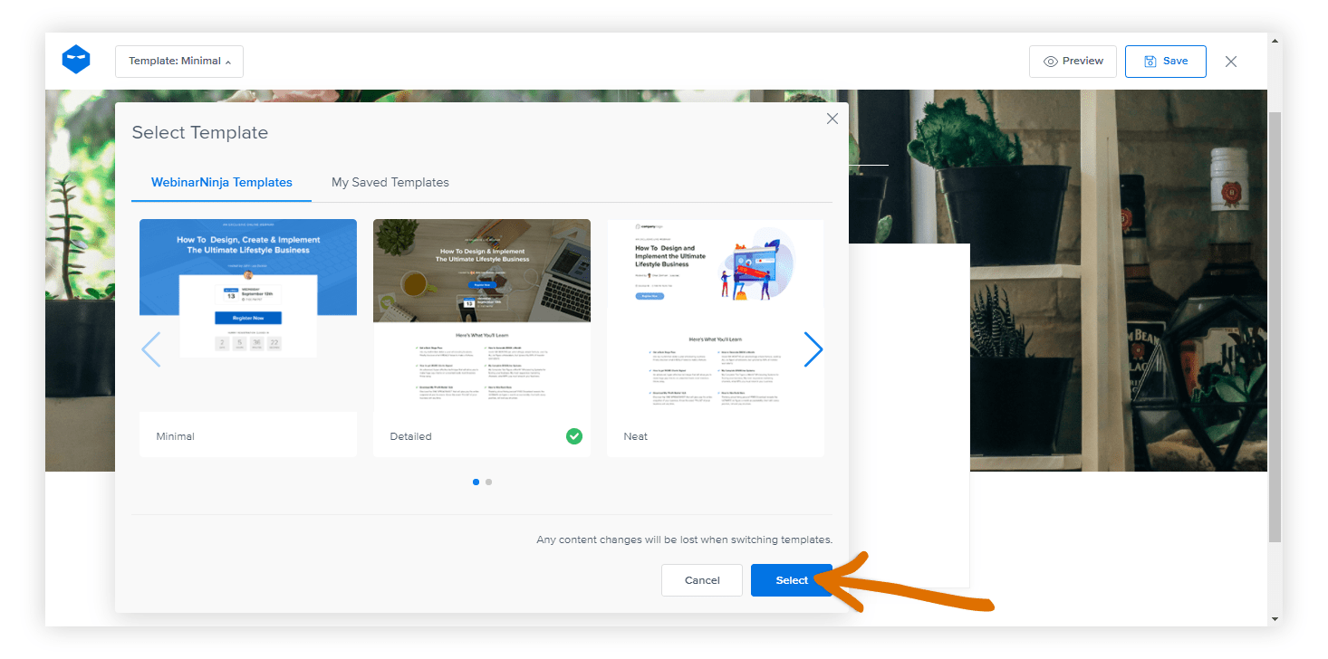
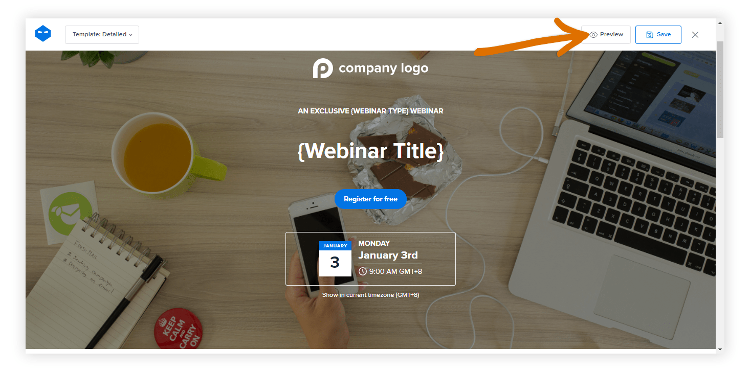
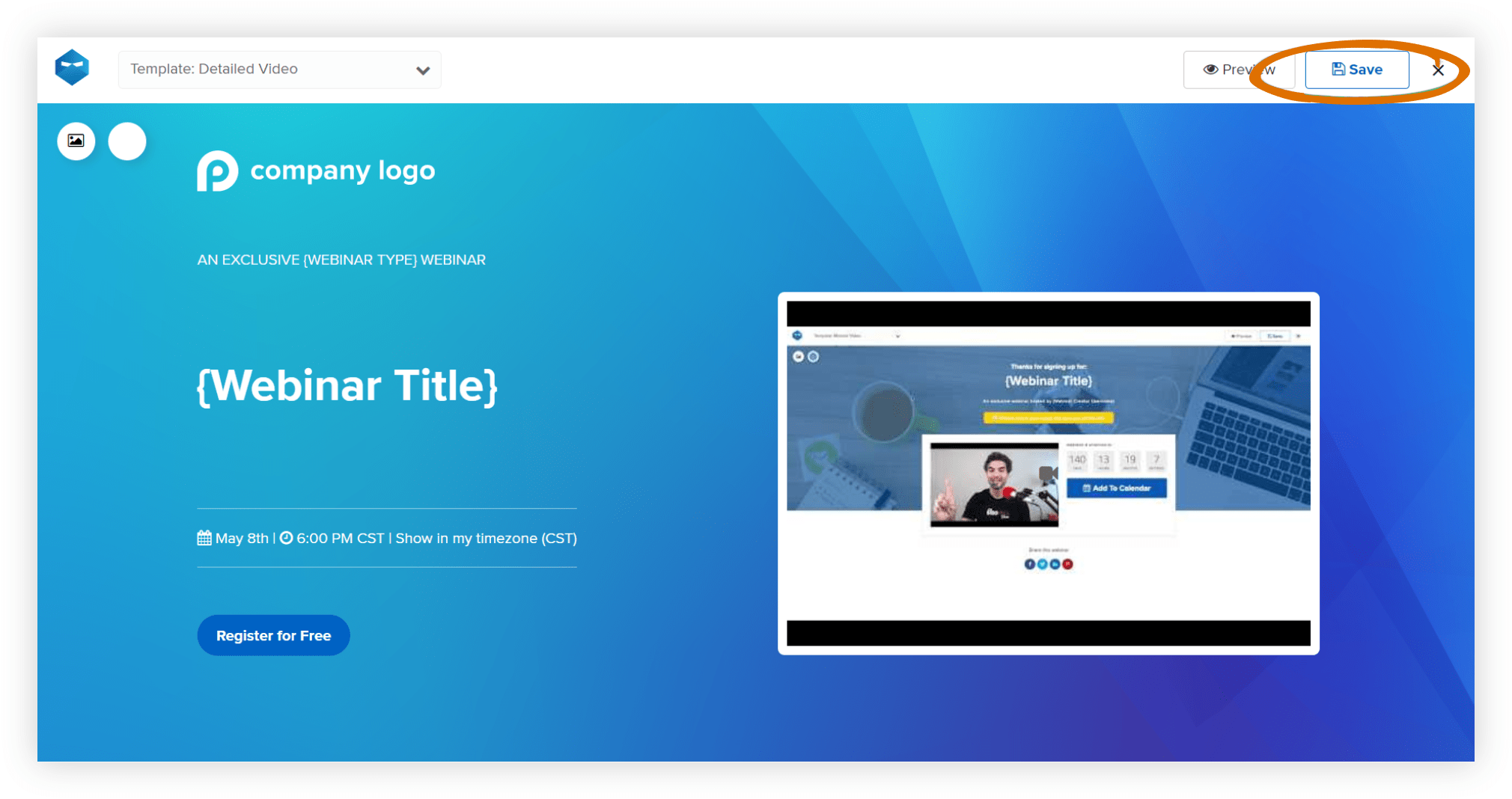
Step 1: Launch the Page Builder & Select Your Template
Log in to WebinarNinja and head to “My Webinars.” Find your webinar, click “Options,” then choose “Registration Page.” This opens the page builder—your creative dashboard.
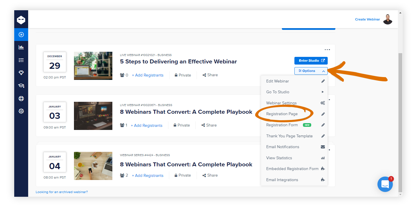
At the top left, pick from one of four stylish templates and click “Select.”
Step 2: Design the Look — Backgrounds, Videos & Branding
Your page’s visual appeal starts here:
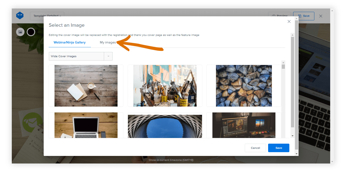
- Backgrounds: Click the image button to select from the gallery, upload your own, or remove it for a sleek color background using the color picker.
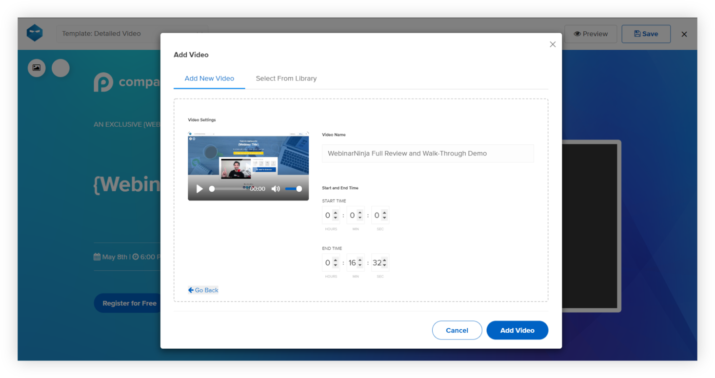
- Video Option: For the Detailed Video template, hover over the video placeholder, click “Insert Video,” and add a YouTube URL (with start/end times if needed).
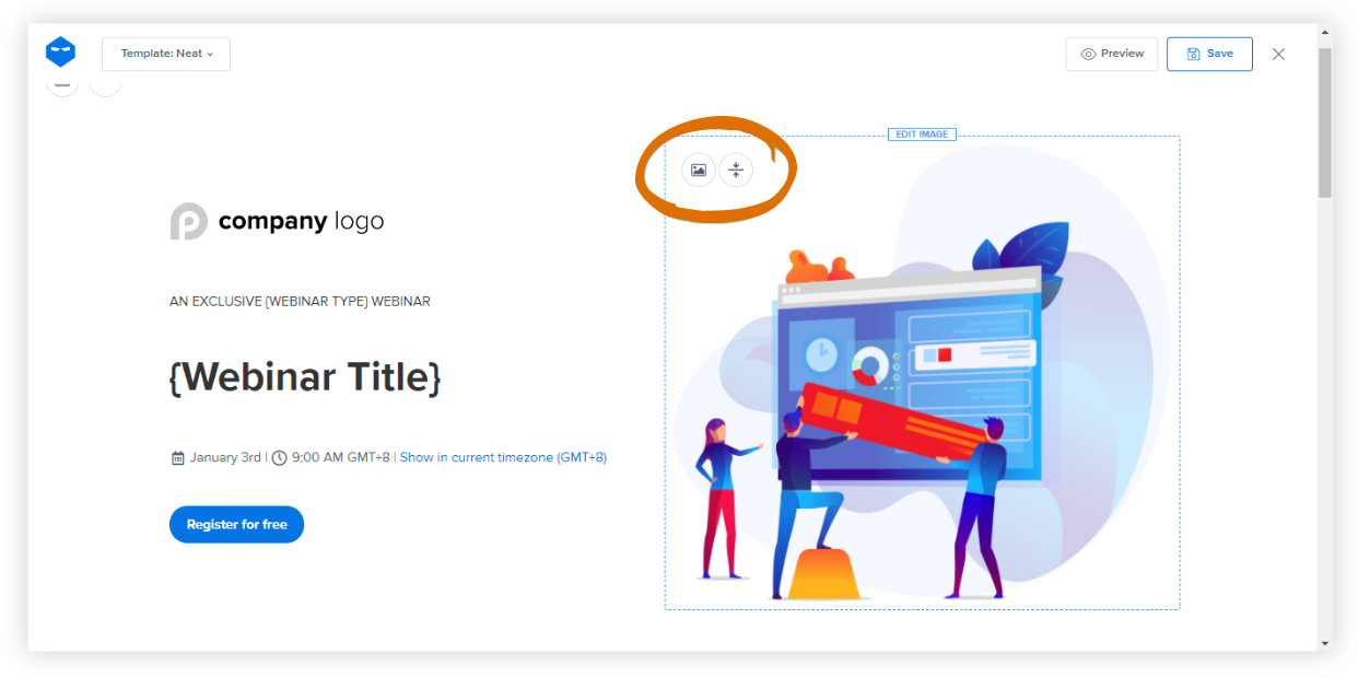
- Logo & Title Image: Upload your logo by clicking the placeholder. For the Neat template, add a striking title image too.
- Theme Personalization: Adjust button colors and text (via the color or ‘A’ button), and align with your brand palette for maximum visual impact.
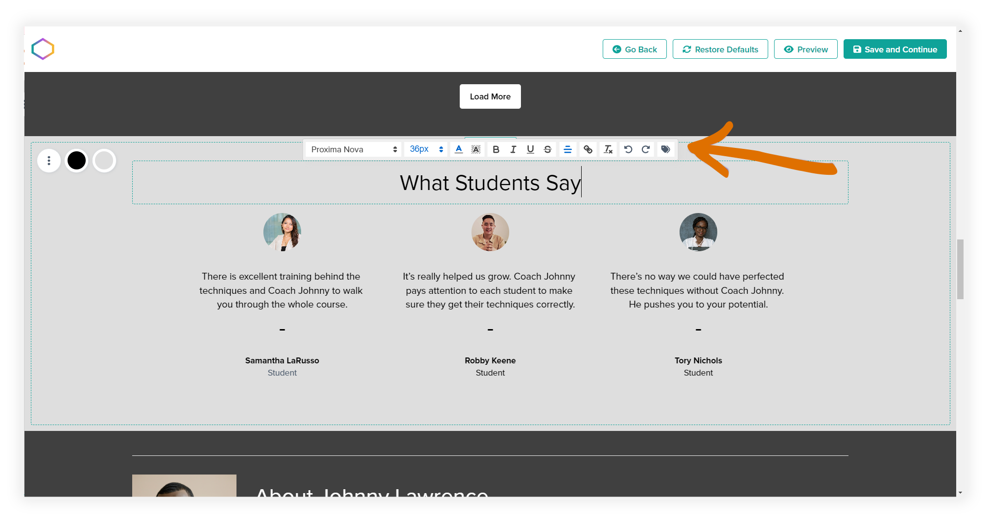
Step 3: Customize the Content — Text, Tags & Formatting
Make your message resonate:
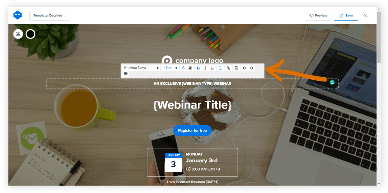
- Edit Inline: Click any text area to format text (font, size, color, alignment, hyperlinks).
- Dynamic Tags: Use smart tags like Webinar Title, Host, Date, and more to auto-insert correct info and avoid manual errors.
Hero Image Tip: Adjust the overlay color to make your headline pop.
Step 4: Add Engagement Features — Bullet Points, Host Bios & Social Proof
Boost credibility and clarity:
- Bullet Points: Use them to spotlight key takeaways. To tweak the layout or remove this section, click on an empty area and hit “Edit Section.”
- Host Introduction: Upload a photo and add a short, friendly bio—or promote a product if relevant.
- Optional Add-ons: Use the Neat template to add testimonials, a powerful tool for social proof.

Step 5: Final Touches — Preview, Save & Streamline for Future Use
You’re almost done:
- Extras: Adjust calendar colors, toggle the countdown timer or social sharing buttons, and even translate the page into multiple languages. Click “Preview” to see how your page will appear, then hit “Save.”
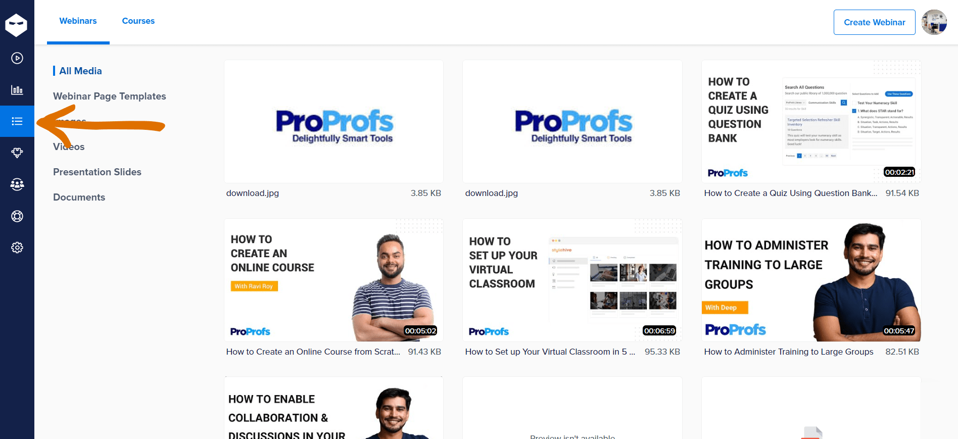
- Manage Media: Use WebinarNinja’s media library to edit, delete, or duplicate templates and files easily.
Ta-da! You have just created the most interesting and high-converting webinar registration page for your webinar.
Wish to know how to track its performance? Walk along with me!
How to Track Registration Page Performance
After you create webinar registration pages effectively, ensuring their highs and lows is equally essential. And while you use a good webinar tool like WebinarNinja, you get built-in registration page performance tracking capabilities.
All you need to do is locate your webinar on the dashboard and click “Reports.”
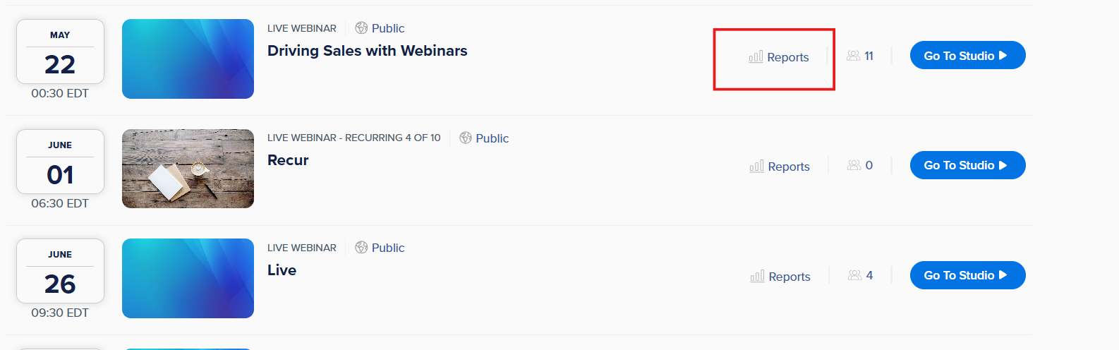
That’s it. You will be redirected to the “Webinar Statistics” page, which informs you about:
- Unique Visits – the number of individual users who landed on your registration page.
- Registrants – the total count of people who signed up for your webinar.
- Conversion Rates, including:
- Sign-up rate: percentage of visitors who registered (visits vs. registrations).
- Show-up rate: percentage of registrants who attended the live webinar.
- Replay show-up rate: percentage of registrants who viewed the replay.
You can also view these metrics over daily, weekly, or monthly timelines, and export the data to CSV for deeper analysis. This allows you to monitor trends, evaluate promotional effectiveness, and optimize future registration strategies.
What Are the Key Elements of a High-Converting Registration Page?
Creating a high-converting registration page is crucial for maximizing sign-ups and engagement for your webinars, courses, or events. To ensure your registration page attracts and converts visitors effectively, consider these key elements:
1. Compelling Headline
Your headline is the first thing visitors see. It should be clear, concise, and compelling, highlighting the core benefit of registering. A strong headline captures attention and immediately communicates the value of your event or offering.
Here are some examples:
- “Master SEO: Boost Your Website Traffic in 60 Minutes”
- “Join Our Live Webinar on Cutting-Edge AI Trends”
- “Exclusive Access: Expert Tips for Financial Planning in 2024”
- “Learn to Cook Gourmet Meals at Home – Free Live Demo”
These headlines quickly convey the webinar’s value, offering specific benefits to capture attention. They focus on the most attractive aspect of the event to encourage registrations. Read this quick article to learn how to create memorable webinar titles.
2. Clear Value Proposition

Explain what participants will gain from registering. Highlight key takeaways, benefits, and unique features of your event or course. Use bullet points to make this information easy to scan. Make sure the value proposition aligns with your audience’s needs and interests.
3. Visuals and Media
A visually appealing registration page with engaging media can significantly boost conversions. Use high-quality images, consistent branding, and a clean layout. Incorporate videos and infographics that add value and support the content. Ensure all visuals enhance rather than distract.
4. Clear Call to Action (CTA)
Your webinar CTA should be prominent, clear, and action-oriented. Use contrasting colors to make it stand out and ensure the text communicates exactly what will happen when clicked (e.g., “Register Now,” “Sign Up Today“).
Position the CTA button strategically, such as at the top of the page and after key information sections.
5. Social Proof
Include testimonials, reviews, or endorsements from past participants or industry experts. Social proof builds credibility and trust, making potential registrants more likely to sign up. Highlight positive experiences and outcomes from previous events or courses.
6. Simple Registration Form
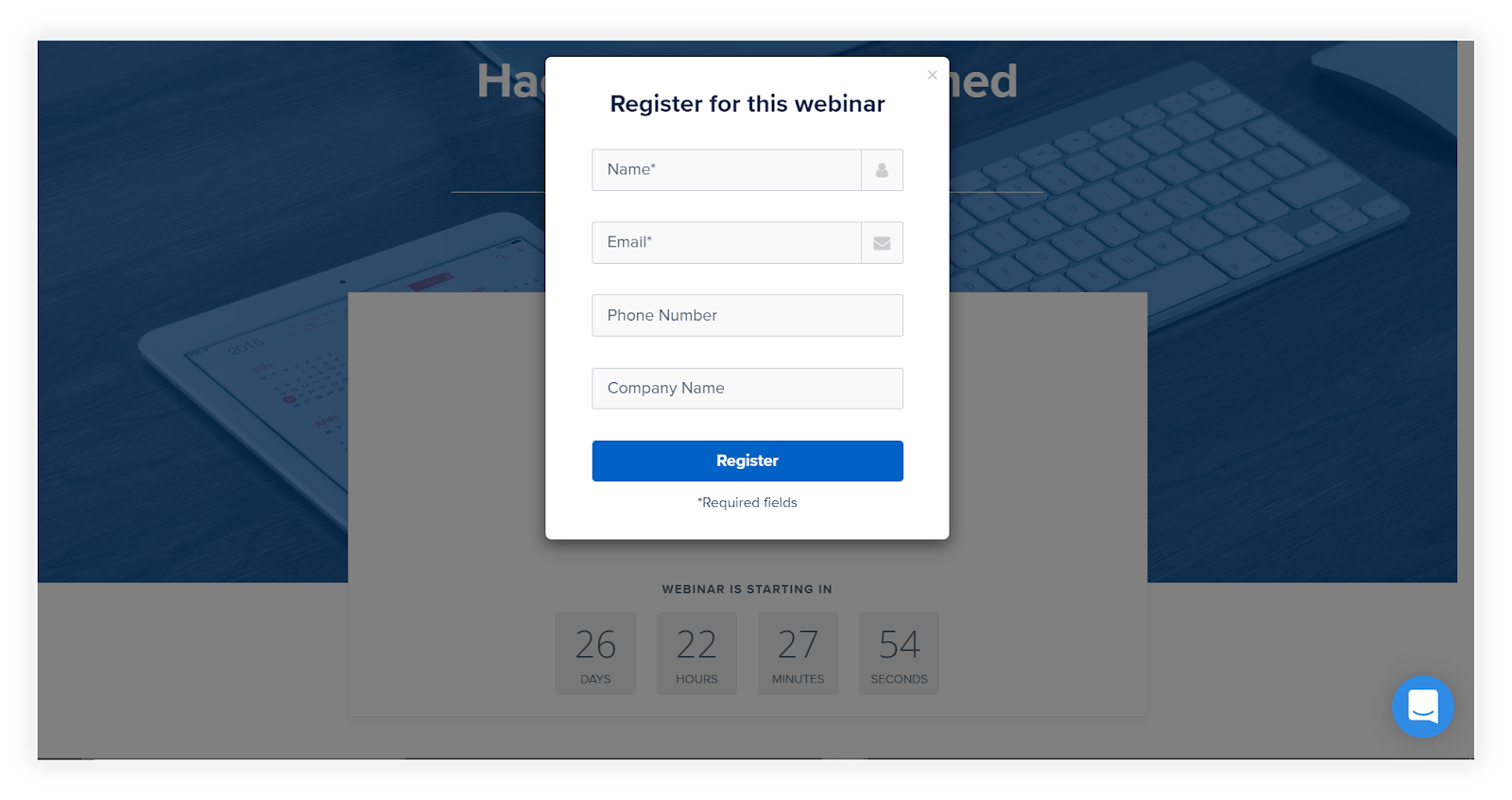
Keep the registration form short and straightforward. Ask only for essential information to reduce friction and simplify the process. The fewer fields required, the higher the likelihood of completion. Consider using auto-fill options and progress indicators to enhance user experience.
7. Mobile Optimization
Ensure your registration page is mobile-friendly. With a significant number of users accessing pages via mobile devices, a responsive design is crucial. Test the page on various devices to guarantee a seamless experience for all users.
8. Urgency and Scarcity
Create a sense of urgency or scarcity to encourage immediate action. Use limited-time offers, countdown timers, or highlight a cap on available spots. Communicate the benefits of early registration to motivate quick sign-ups.
9. Privacy Assurance
Assure registrants that their information is secure. Include a brief statement about your privacy policy and data protection measures. This reassurance can alleviate concerns and build trust, particularly when sensitive information is requested.
Why Your Webinar Registration Page Matters (More Than You Think)
As someone who’s spent years helping businesses optimize their webinars, I can tell you this—your registration page isn’t just a formality. It’s the gateway to your entire webinar funnel.
A compelling registration page does more than collect names and email addresses. It’s your first impression, your trust builder, and often, the make-or-break moment for a potential attendee.
Let’s break down why it holds such power:
1. It Sets the Tone for Your Webinar
Your registration page is the first real interaction a potential attendee has with your brand in this context. If it feels polished, professional, and relevant, you’ve already won half the battle. If it’s clunky or unclear, you risk losing them before the conversation even starts.
Think of it like a handshake at a business meeting—it’s where credibility begins.
2. It Answers Two Critical Questions
Within seconds of landing on your page, every visitor subconsciously asks:
- Is this worth my time?
- Can I trust this person with my email address?
If you can’t clearly and confidently answer “yes” to both, you’re likely losing valuable leads—some of whom may never come back.
3. It Drives Conversions—Not Just Registrations
A great page doesn’t just attract clicks; it converts interest into commitment. That’s where design, copy, and messaging strategy all come into play.
From our own data and experience, we’ve seen that registration pages that clearly state:
- What the webinar is about
- Who is it for
- What attendees will learn or gain
- How long will it take
…consistently outperform vague, generic ones by over 30% in sign-up rate.
4. It Enables Future Engagement
Even if someone doesn’t attend your live webinar, having their email opens doors. You can send them replays, share additional content, or re-engage them later with a personalized offer.
But if your registration page fails to convince them to sign up, that opportunity is gone—and so is the ROI from your ad spend or email outreach.
Mastering Webinar Registrations: The AIDA Approach
Whether you’re new to webinar marketing or already familiar with persuasive copy, the AIDA framework offers a powerful mental checklist for your registration page. It stands for Attention, Interest, Desire, and Action—and it’s how the most effective pages guide visitors from glance to registration.
Let me explain to you how to implement each of these on your registration pages.
1. Attention
A classic scene from the film adaptation of the Pulitzer Prize-winning play Glengarry Glen Ross.
Grabbing someone’s attention is the first step in converting a visitor into a registrant.
You really can’t get anyone to do anything if you don’t have their attention. With everything that can distract us in this day and age – notifications, messages, alerts – we need to command our visitors’ attention so they can take the action we need them to take.
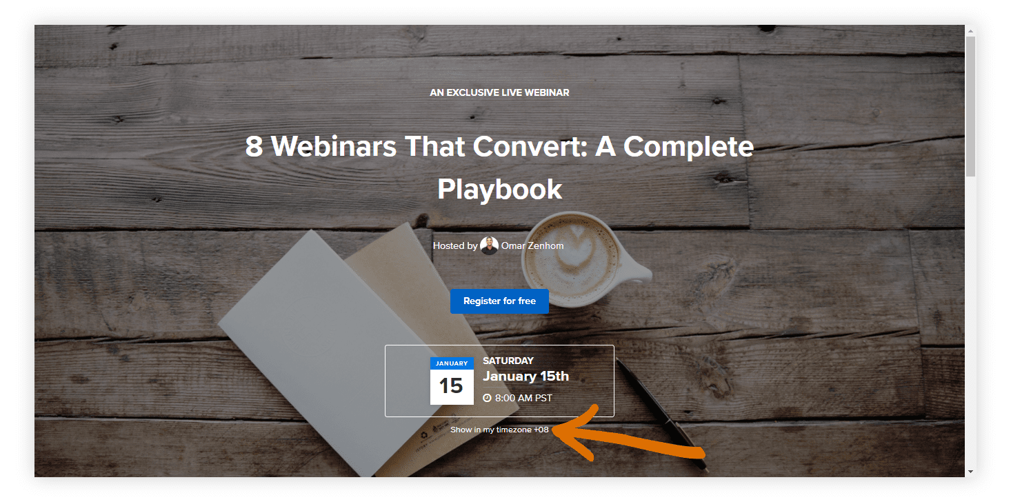
An interesting hero image can grab your visitors’ attention immediately. This allows them to zero in on your registration page and block out all other distractions. As they say, an image is worth a thousand words.
Advertising and marketing legend David Ogilvy’s signature move in his advertisements was using images to grab people’s attention.

Who’s that distinguished man on the red carpet? What’s up with that guy with the eye patch? What’s his story?
Humor is one of the fastest, most effective ways to be noticed when you have a second or two to work with.
2. Interest
Now that you have their attention, it’s time to pique their interest.
Let’s take a look at an example. The combination of a dog raising its paw + the headline of “GOT QUESTIONS ABOUT HOW TO TRAIN YOUR DOG?” makes a visitor smile, and curiosity sets in.

3. Desire
Attention and interest are one thing, but actually wanting something is another thing altogether.
A second headline that cuts through the noise and triggers desire can do wonders. One of the best ways to trigger desire is to ask a question. Our brains are hardwired to seek out answers when a question is asked. So, ask questions to elicit answers that confirm desires.
In our example registration page, we ask the question: “Wish You Could Civilize Your Dog?”

If your dog is driving you mad, then you can’t help but answer with an emphatic “YES!”
This creates the desire to get answers on how to get your dog to behave.
4. Action
Make it dead easy to take action.
The action we want visitors to take is to register for the webinar, and a clean, clear registration button allows visitors to understand how to take that action. All the visitor needs to do is click a button to complete a simple registration form.
Why the 2-step process?
We split-tested thousands of registration pages over the years and found that a 2-step registration process lowers overwhelm for visitors and increases conversions by up to 200%.
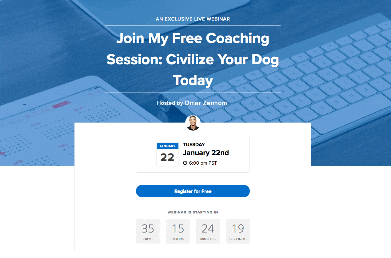
Notice how all four elements of AIDA are above the page’s fold, meaning that a visitor doesn’t need to scroll to experience all the elements on a computer.
Any additional information you may want to add to the page should be added beyond the fold.
Boost Leads & Sales With Effective Webinar Registration Pages
Creating high-converting webinar registration pages is essential for maximizing sign-ups and ensuring attendees show up. By following our step-by-step guide and utilizing customizable templates, you’ll be well on your way to higher conversions and successful webinars.
Remember, the key elements—compelling headlines, clear value propositions, engaging visuals, and strong calls to action—can make a significant difference.
Whether you’re just getting started or refining a proven webinar strategy, WebinarNinja’s customizable page builder lets you test, iterate, and optimize every aspect of your registration flow. The best part? You can explore all of it for free for 14 days. Your first webinar is on us—try it now and start converting more visitors into attendees.
Frequently Asked Questions

2. Can I embed the registration form on my own website?
Yes, many platforms allow you to generate an embed code for your registration form. With WebinarNinja, this code can be placed on any landing page or website you control, so visitors can sign up without ever leaving your domain. It's especially helpful for marketers who want tighter control over conversion paths and page performance.
3. Can I offer multiple webinar times on one registration page?
Most webinar tools often support recurring events. Attendees simply select the date and time that works for them. This is great for lead generation campaigns, demos, or training, where flexibility in scheduling boosts sign-ups and attendance.
4. How do I track where webinar sign-ups are coming from?
You can usually use UTM parameters with your registration links to trace the source of each sign-up. WebinarNinja takes it further by supporting URL parameters and integrating with analytics tools. This allows marketers to segment traffic from ads, email, and social media, helping you measure ROI and optimize for top-performing channels.
5. Can I connect the registration page to my email marketing tool?
Most modern webinar platforms support CRM and email tool integrations. WebinarNinja, for example, integrates with services like Mailchimp, ConvertKit, and HubSpot. When someone registers, their info is automatically sent to your connected tools, enabling you to tag, segment, and trigger email sequences without any manual work.
6. Are there any built-in security features for webinar sign-ups?
Security is standard across webinar tools, but the exact features vary. WebinarNinja allows you to restrict sign-ups by email domain, use CAPTCHA to block spam, and even approve each registrant manually. You can also password-protect your webinar to keep it exclusive, making it ideal for private or invite-only events.
Want to host a webinar for free?
Use WebinarNinja to teach, improve marketing, and grow your sales.